


The Power of Color in Memorial Choices
What if the color of an urn could say everything you can’t put into words? Welcome to the Funeral.com podcast, where we explore how color symbolism shapes the way we remember, honor, and heal.
I'm your host, and today, we're translating the invisible language of emotion—grief, remembrance, love—into the visible tapestry of color. But why do seemingly simple choices—like navy or sky blue—suddenly feel monumental when we're grieving?
We’ll dive into color psychology and color-in-context, two concepts that explain why a white urn might feel peaceful to one family but cold to another—much like how a favorite song can evoke joy or tears depending on when you hear it.
Here’s our roadmap: First, we’ll uncover why color meanings are so personal. Next, we’ll break down what different colors symbolize in memorial settings, how to blend emotion with practicality, and how color comes alive in urns, keepsakes, and jewelry—even for beloved pets. Finally, I’ll share gentle guidance for choosing a palette that feels true to your loved one—and your budget.
If you’ve ever asked, 'Does it matter what color I choose?'—this episode is for you. Let’s begin where color meets compassion.
Why Color Meanings Are Deeply Personal
Why does choosing a color during grief feel so much heavier than picking paint for a bedroom? Now you might be thinking, 'Aren’t colors just colors?'—but science and tradition say otherwise.
Color symbolism is shaped by three powerful forces: our bodies, our culture, and our context. Color psychology, the study of how hues affect our minds, shows that colors can influence mood and focus. For example, blue often calms our nervous system, much like a weighted blanket.
But culture steps in next. Did you know a color like white can mean hope and new beginnings in one culture, but mournful emptiness in another? And let’s not forget context: that same red flower that lights up a wedding can feel too intense at a quiet memorial.
So, if you’re agonizing over whether navy or teal is 'right,' remember—meaning isn’t fixed. Colors are emotional codes, and only you know the key. The 'right' color is what communicates your truth in that unique moment and place.
Let me tell you a story: A family once chose a green urn for their father—not because green is traditional, but because he loved gardening. That choice made the memorial feel like him, not just like a ceremony.
Common Memorial Color Meanings—And How to Use Them
So, what do colors usually mean when honoring a life? Think of this as your color symbolism cheat sheet, not a test. Let’s break down a few anchor hues, using color theory and psychological association as our guides.
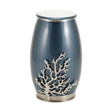
Blue is about calm, trust, and continuity—a steady horizon. It’s a favorite for urns and memorial jewelry because it quietly signals wisdom, like a navy suit at a graduation.
Green speaks of renewal and peace. If the person loved nature or you’re planning an eco-friendly tribute, green feels like hope after winter. White brings clarity and a peaceful, sacred space—think of it as a blank canvas, letting memories take the spotlight.
Black, often seen as formal and protective, can ground a ceremony, while purple and deep blues carry a sense of dignity and reflection—perfect for honoring mentors or elders. Red, on the other hand, can be powerful but tricky. Used sparingly, it’s a burst of love—a single rose, not a whole bouquet.
You might ask, 'How do I combine these without overthinking?' Start with one anchor color, one support, and one accent—a simple palette, much like dressing for both comfort and style in a new season of life.
How to Choose a Memorial Palette That’s True to Them
How do you make color choices feel less like a quiz and more like a tribute? Here’s where intention meets reality. Instead of starting with 'What does this color mean?', ask, 'What did this color mean to them—or to us as a family?'
You may be thinking, 'But what if I get it wrong?' Let me offer reassurance: There’s no wrong answer when the decision is rooted in love. Start with the basics—what colors did they wear, love, or decorate with? Which shades show up in family photos or favorite places?
Then, decide what emotional tone you want—calm, warm, bright, formal, earthy, or softly sacred. Use an anchor neutral like cream or wood to ground the palette, and let your meaningful color show up in small, repeated ways—a ribbon, a flower, a candle.
In design terms, think of this as applying color theory: an anchor, a support, and an accent, working together like notes in a chord. The result isn’t decor—it’s a space where love can land, and where each visitor feels the presence of your person.
It’s not about getting it perfect, it’s about getting it personal. That’s how a memorial space can hold both grief and gratitude, side by side.
Color in Urns, Keepsakes, Jewelry, and Pet Memorials
Let’s get practical: how does color actually inform your choices for urns, keepsakes, or jewelry—especially as memorialization evolves? With cremation now the majority path in the US, families are selecting not just one central urn, but also sharing urns, keepsakes, and even cremation necklaces.
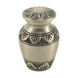
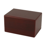
You might be wondering, 'Does the color of the urn matter as much as the material or size?' Absolutely—because color is often the first emotional signal, while material and size are about fit and logistics. For example, a moonlight blue and pewter urn communicates serenity and depth, while a cherry woodgrain box feels timeless and warm.
For jewelry, color might be the metal—sterling silver or gold-tone for elegance, a vibrant enamel inlay for personality, or a gemstone accent for subtle symbolism. In pet memorials, families often choose the color of a beloved collar or the shade that best matches their pet’s spirit—playful, gentle, or brave.
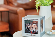
It’s also key to remember personalization: engraving, photo holders, or even figurine urns let a color choice become a story. Color theory and personalization work together, so you’re not just selecting an object; you’re building a connection.
If you’re feeling overwhelmed, resources like funeral.com’s urn and jewelry guides can help break the decisions into steps—so your choices reflect love, not just logistics.
Closing: Three Keys for Meaningful Color Choices
So, what are the takeaways when color becomes part of memorial planning? First, color meanings are deeply personal—let emotion and memory lead, not just tradition. Second, practical choices—like urn size or jewelry type—can work with color to reflect your loved one’s presence. Third, color is a language, not a test; meaning comes from intention, not perfection.
What’s one action step you can take? Choose one small detail—a ribbon, a flower, a candle—whose color simply feels 'right.' Let that be your anchor as bigger decisions unfold.
“Thank you for sharing this moment with us. If you’re looking for ways to honor someone special, you can explore urns, keepsakes, and memorial ideas at Funeral.com. However you remember, we’re honored to walk alongside you.”


