
The Meaning of Blue in Memorials and Cremation Choices
Picture this: you walk into a softly lit room, heavy with loss. What’s the one thing that quietly says 'it’s okay, you’re safe here'? For many, it’s the color blue—a hue that wraps the moment in calm. Welcome to the Funeral.com podcast, where today we unlock the surprising science and emotional nuance behind blue in memorial spaces. I’m your guide, and together we’ll explore how blue steadies us in grief, how to choose the right shade for urns or jewelry, and why color psychology matters more than most people realize.
Why is blue the world’s most popular color, and how does it go from corporate logos to the centerpiece of a memorial? You might be wondering: 'Can color really make a difference when everything feels upside down?' The answer isn’t as simple as 'blue equals calm.' Color psychology—a field that studies how colors influence our mood and behavior—shows us that blue can be both anchor and ocean, a signal of trust or a vessel for sadness.
Here’s the roadmap: first, we’ll dive into why blue feels safe, then explore its bittersweet undertones. We’ll break down shade selection, see how blue shapes everything from urns to pet memorials, and end with practical steps for finding 'your blue.' Ready for a journey through memory, meaning, and the quiet power of color? Let’s begin.
Why Blue Feels Safe: Universal Trust and Comfort
Let’s start with a question—why is blue the 'safe' choice for so many families during loss? Research from YouGov shows that blue consistently ranks as the world’s favorite color across cultures and continents. But that’s not just a fun fact; it’s a practical insight for memorial planning. In color psychology, blue is associated with reliability and clarity. Think of it like the steady beat of a metronome—offering predictability when your life feels anything but.
Now, if you’re planning for a diverse family with different tastes or backgrounds, safe doesn’t mean boring. Blue signals dependability the way a bank’s uniform or a hospital’s scrubs do—there’s a reason those industries rely on it. At a memorial, blue’s psychological effects—such as lowering heart rate or promoting a sense of trust—can quietly ease tensions without demanding anyone be 'fine.'
Imagine a family arguing over floral colors. Someone says, 'Let’s just use blue; no one will mind.' What they’re really saying is, 'We need peace.' So when you choose blue, you’re not copping out. You’re creating a neutral, unifying space—something everyone can lean on, even when words fail.
Blue’s Two Faces: Calm, Sadness, and the Role of Shade
But here’s the twist: blue isn’t just about comfort. It’s also the color of sadness and solitude—think of phrases like 'feeling blue.' Doesn’t that seem contradictory? Actually, it’s what makes blue so powerful in grief. Unlike bright yellow, which might feel jarring, or stark white, which can be clinical, blue holds space for both peace and honest sorrow.
The technical terms here are hue and saturation. Think of 'hue' as the base flavor, and 'saturation' as how strong or muted that flavor is—just like coffee brewed strong or weak. A soft, dusty blue is like a gentle hug. A harsh, icy blue under fluorescent lights? That’s more like cold water on your face—refreshing for some, but too much for others.
Now, maybe you’re thinking, 'Does the exact shade of blue really matter?' Absolutely! A navy blue might ground the space, but if overdone, it can feel somber or closed-off. A teal or blue-green might evoke nature and healing. The secret? Choose a blue that reflects the person you’re remembering, not just the latest décor trend.
Personalizing Memorial Choices: From Urns to Jewelry
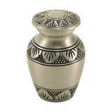
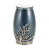
Let’s talk about how blue shows up in real decisions—from cremation urns to jewelry. With cremation rates climbing past 60% in the U.S., families now have more flexibility. Suddenly, you’re not just picking out a one-time display. You’re choosing a color and style that could shape your space for months, even years.
Think about practical design terms like 'accent color' and 'visual weight.' Blue, used as an accent color—a ribbon, a border on a keepsake urn, a gentle detail in cremation jewelry—can soften the environment and keep the focus on memory, not material. But if you’re keeping ashes at home, the urn’s color can quietly influence how you feel each day. A medium blue might blend with natural wood or green plants, while a bold royal blue could draw attention.
Some families choose small keepsake urns or cremation jewelry to keep loved ones close—physically and emotionally. Blue’s neutrality lets these items live in everyday spaces, offering comfort without making grief louder than it already is. And if you’ve ever worried, 'Does this look too much like an urn?'—blue often helps the item feel more like a tribute and less like a reminder of loss.
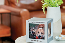
Blue in Pet Memorials and Returning to Nature
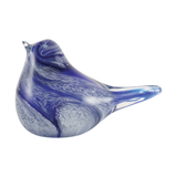
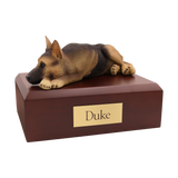
What about pet memorials? Grieving a pet is deeply personal, often private, and blue can be incredibly comforting here. Imagine a small blue urn beside a favorite photo or a blue-accented figurine that looks just like your companion. Blue in this context isn’t just a color—it’s a gentle nod to sky, water, and open space, offering a sense of release and renewal.
Let’s bring in two more technical terms: symbolism and ritual. Symbolism here is easy—blue stands for serenity, loyalty, and even infinity, just like the sky overhead. Ritual refers to the ways we say goodbye. For families considering water burial or scattering ashes at sea, blue becomes more than decoration. It’s a living symbol, a way to connect memory with the movement of water and the cycle of nature.
You might wonder, 'Isn’t this just sentiment?' Maybe, but studies show that meaningful symbolism helps people process loss. So whether it’s a blue keepsake, an urn, or a piece of jewelry, you’re reinforcing a quiet ritual—a small but steady anchor in a sea of change.
Wrapping Up: How to Choose 'Your Blue' with Intention
Let’s bring it all home. What are the three key takeaways from our journey through blue? First, blue is more than a safe bet—it’s a bridge between calm and sadness, able to unify families and support honest reflection. Second, the specific shade and placement of blue matter; soft, muted tones soothe while bold or harsh hues can overwhelm. Third, blue’s versatility lets it fit seamlessly into memorial urns, pet keepsakes, jewelry, and ceremony details, offering steadiness without demanding attention.
What’s one concrete step you can take? If you’re planning a memorial, pause and ask yourself: 'What job does blue need to do for us right now?' Does it need to calm, honor, connect, or simply blend? Use this intention to guide your choice of urns, keepsakes, or jewelry—don’t get trapped by perfection. Imagine someone saying, 'But what if we choose wrong?' Here’s the truth: in grief, there is no perfect, only what feels steady today.
Remember: blue won’t remove pain, but chosen with care, it can help you live alongside it—one gentle day at a time. “Thank you for sharing this moment with us. If you’re looking for ways to honor someone special, you can explore urns, keepsakes, and memorial ideas at Funeral.com. However you remember, we’re honored to walk alongside you.”


