


Periwinkle: The Color of Calm and Remembrance
Periwinkle’s Secret: More Than Just Another Blue
Let’s start with a simple question: have you ever looked at a wall, a flower, or even a keepsake and felt a color reach out to you? Chances are, it wasn’t just ‘blue’—it might’ve been periwinkle. Now you might be thinking, 'Isn't periwinkle just a fancy name for light blue or lavender?' Not quite. Periwinkle sits in a delicate space between blue and purple—lighter than lavender, airier than navy, softer than violet. In technical terms, you might see it referenced as hex code #CCCCFF. Think of this code like GPS coordinates for designers: it helps you land right on that sweet spot between steady blue and imaginative purple. Here’s the thing: periwinkle’s magic is about balance. Too much blue can feel cold or distant; too much purple gets dramatic fast. But periwinkle? It’s approachable, gentle, and quietly uplifting. So the next time you see a spring flower or a soft accent in a memorial room, don’t just call it blue—periwinkle deserves its own moment.
Color Psychology: Calm, Clarity, and Creativity in One Tint
Let’s dive deeper—how does periwinkle actually make us feel? Color psychology tells us that certain shades do more than decorate; they shape our mood and even our focus. Blue typically signals reliability, trust, and calm—it’s why banks and hospitals love it. Purple, on the other hand, brings in a sense of reflection and imagination, but sometimes leans too mysterious. Periwinkle splits the difference. The technical term here is ‘color temperature’—periwinkle is a cool tone, but unlike icy blues, it doesn’t chill the room. Instead, it’s like a soft exhale—a color that soothes without dulling your senses. And here’s a twist: research on blue-enriched light shows it can actually boost alertness, not just relaxation. So periwinkle lets you settle and stay open-minded at the same time. If you’re designing a home office or a memorial shelf, ask yourself: do you want clarity without harshness? Periwinkle could be your answer.
Symbolism of Periwinkle: Serenity, Memory, and Enduring Tenderness
Why does periwinkle keep turning up in spaces meant to comfort and remember? It’s not a coincidence. Let me tell you a story: I once saw a family choose periwinkle ribbons for a memorial, not because they loved the color, but because it just ‘felt right.’ That’s symbolism in action. Technically, periwinkle gets its name from the vinca plant—a ground cover with resilient, blue-purple flowers. In the language of flowers, periwinkle has meant friendship, remembrance, and enduring affection for centuries. Now you might wonder: ‘A color can do all that?’ Absolutely. Periwinkle isn’t just visually cool; it’s emotionally gentle. It’s the rare shade that can hold both calm and feeling, making it ideal for memorial spaces, hospice rooms, or comforting gifts. Its symbolism is why so many brands in wellness and remembrance quietly reach for it when they need a color that says, ‘I’m here, steady and soft.’
Design in Practice: Using Periwinkle in Branding and Interiors
If you’re a designer—or just trying to make your home or brand feel a little more ‘together’—periwinkle is a secret weapon. But how do you actually use it? Here’s the conflict: go too heavy, and your space feels washed out. Go too subtle, and you miss the emotional impact. The solution lies in color pairing and proportion. Picture this: periwinkle plus warm white and light wood gives you a calm, lived-in look—perfect for a bedroom or memorial shelf. Add charcoal, and suddenly your branding feels modern and grounded. The technical term here is ‘contrast ratio,’ which is just a fancy way of saying: make sure your text stands out against your background. Periwinkle works best as an accent or secondary color. Anchor it with strong neutrals and use high-contrast typography to keep things readable and authoritative. Whether you’re designing a wellness brand or a remembrance nook, periwinkle lets you be gentle without fading into the background.
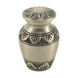
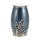
Periwinkle in Memorials: Gentle Guidance for Difficult Choices
Let’s talk about one of the most important, and most sensitive, uses for periwinkle: memorial design. When someone dies, the choices can feel overwhelming—urns, keepsakes, ceremonies, colors. Now you might ask, ‘Does color really matter when grief is so raw?’ It does, and here’s why: color can set the tone for healing, not just decoration. Periwinkle in memorial spaces creates a sense of calm and intention—making a remembrance shelf feel like a cared-for part of the home rather than a heavy shrine. From a practical standpoint, pairing periwinkle with soft neutrals and natural textures makes the space approachable. If you’re choosing cremation urns, keepsake jewelry, or pet memorials, periwinkle signals steady warmth and gentle support. The technical terms at play? ‘Visual hierarchy’—how your eye moves across a space—and ‘emotional resonance.’ If you want a memorial that feels lived-in, not imposed, let periwinkle be your quiet guide. Remember: the best design serves both function and feeling.
Building a Modern Periwinkle Palette: Color Pairings and Practical Tips
So you’ve decided periwinkle’s the right mood—but how do you actually build a palette that feels fresh, not dated? Here’s the setup: periwinkle is flexible, but only if you let it breathe. Mix it with warm whites and light woods for a bright, comforting feel; pair it with charcoal or black accents for a contemporary edge. Want a softer vibe for wellness or memorial brands? Try periwinkle with blush, sand, or sage green. And here’s a technical trick: always check your main periwinkle hex code—#CCCCFF is a safe digital anchor—but remember, lighting changes everything. Sample your colors at different times of the day, especially if you’re painting a room or designing for screens. The conflict: color can shift quickly and throw off your emotional goal. The resolution? Test, adjust, and remember the role of ‘undertones’—those subtle hints that make a color feel warm or cool, calm or active. In the end, a good periwinkle palette feels supportive, modern, and just a little bit magical.
Discover more in the full article: Periwinkle Color Meaning: Psychology, Symbolism, and How to Use It in Design


