


Meaningful Memorial Colors: Traditions, Tips & Personalization
Why Color Matters in Mourning and Memorials
“This is the Funeral.com podcast. We’re here to talk about grief, remembrance, and the realities of loss - whether that includes cremation, burial, or something in between. Because end-of-life conversations are really about the people we love, and the lives we live.”
When we lose someone, making decisions can feel overwhelming—what kind of service, what to say, how to honor their memory. But color? It’s the silent detail that can speak volumes before a single word is said. Why does color matter so much when we grieve? Imagine walking into a room dressed in black—automatic, right? But look closer: color is everywhere, from the flowers to the urn, from the photos to the tablecloth. Color psychology tells us that our brains process color faster than any other visual cue; it sets the emotional tone instantly. Now, you might be thinking, 'Isn’t black always expected?' Actually, no. Around the world, mourning colors are as diverse as the people we love—ranging from black and white to deep blue, purple, and even celebratory reds. The right shade isn’t about following a rulebook; it’s about creating meaning when words run out. Let me tell you a story: a family I met chose sky blue for their father’s memorial because he was a fisherman. That single color brought calm to the chaos of their grief. That’s the power of intentional color.
So, let’s explore how color communicates care, and why it’s often the one detail that lingers in memory long after the service ends.
Traditions in Transition: Black, White, and Beyond
Let’s zoom in on traditions. For centuries in the West, black was the default signal for mourning—practical, recognizable, and almost uniform in its message. But even here, custom bends. Families now choose navy, charcoal, cream, or a favorite accent color, prioritizing personality and comfort over rigid etiquette. This shift is partly driven by what sociologists call 'ritual adaptation'—when old customs flex to fit new realities like blended families or memorials held at home. Now, switch continents: in many Asian cultures, white is the color of mourning, symbolizing purity and a break from earthly ties. Hindu funerals also favor white, drawing on centuries of spiritual symbolism. And in Catholic and some Christian services, you’ll often see purple—vestments and flowers—signifying penance and humility, what theologians call 'liturgical color coding.'
Are you wondering, 'What if I don’t know the right color?' That’s where the golden rule comes in: follow the family’s lead. When in doubt, choose subdued tones and ask if there’s a preference. Respect, not color, is the universal language.
Meaning in the Details: Flowers, Decor, and Memorial Objects
Color isn’t just about clothing. It shows up everywhere: in sympathy flowers, memorial tables, candles, printed programs, even the urn or jewelry families choose to keep close. The design principle at work here is 'visual coherence'—when colors are intentionally chosen, they create a sense of order during emotional upheaval. Think of flowers: a deep red rose might signal love or profound loss in one culture, but feel too intense in another. That’s why florists and families consult guides on 'sympathy flower meanings,' so a kind gesture doesn’t accidentally send the wrong message.
Now, you might wonder: 'Does color really make a difference in how we remember?' Absolutely. Psychologists call this 'associative memory'—our brains link colors to experiences and emotions. A navy blue urn can bring to mind calm and steadiness, while a touch of gold might reflect dignity or celebration of a life well-lived. If you’re planning a memorial table, choose one anchor color, like deep green for grounding, then add two neutrals to keep things harmonious. It’s a simple structure, but it can bring comfort when everything else feels uncertain.
Personalization and Culture: Choosing Colors That Honor
Let’s get practical: how do you actually choose memorial colors without stepping on cultural toes or making things harder for grieving families? Start with the type of service—a formal funeral at a church or temple usually calls for subtle tones, but a celebration of life at a park or home may welcome brighter hues. This is called 'contextual etiquette'—matching visual choices to the setting and spirit of the gathering.
But what if your family spans multiple cultures or generations? Here’s where 'inclusive design' comes in: use accents instead of saturating everything with one color. Maybe a favorite flower at the table, a ribbon, or a colored candle. If you’re unsure—say so in the invitation: 'Guests are welcome to wear black, navy, or her favorite shade of lavender.' That single line can prevent a flood of anxious texts. Remember, the most respectful color is the one chosen with love and clarity, not just tradition.
Colors for Cremation Urns, Keepsakes, and Ongoing Memorials
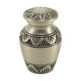
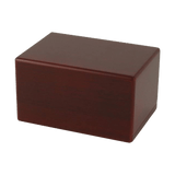
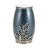
Let’s talk about what happens after the service, when color becomes part of daily remembrance. Choosing a cremation urn or keepsake may feel like a small detail, but it’s actually a deeply personal decision. Materials like pewter or ceramic bring a sense of tradition—think of them as the 'core memory keepers.' Meanwhile, colors like moonlight blue, cherry wood, or classic raku glaze turn the urn from a container into a tribute that fits your home and heart.
Maybe you’ve seen cremation jewelry—a discreet necklace or bracelet that holds a pinch of ashes. Durable alloys and subtle enamel make these pieces wearable every day, a quiet connection you carry with you. For pet loss, color can be even more personal: a figurine urn in the dog’s fur color, or a paw print charm in slate or bronze. Here’s my advice: choose for comfort and meaning, not to impress. The right memorial color helps grief soften into memory.
Practical Guidance: Clarity, Cost, and Lasting Comfort
Finally, let’s address the real-world questions. Families planning a memorial aren’t just thinking with their hearts—they’re checking budgets and looking for peace of mind. Wondering 'How much does cremation cost?' or 'How do I guide guests without awkwardness?' Start by keeping color choices simple and cohesive. A unified palette can make a room feel intentional, even on a budget, by creating what designers call 'visual unity.'
Divvy up the work—one person can gather photos, another flowers, another set up the table—each using the chosen colors for harmony. If you’re arranging a water burial, remember the EPA rules: three nautical miles off the coast for scattering, and biodegradable urns are recommended. All these details can feel heavy, but the truth? The color that matters most is the one chosen thoughtfully, with care for both the person who’s gone and those who remain. Grief is never one-size-fits-all, and neither is color. Choose what speaks to your heart, and you’ll honor a life in the most meaningful way.
“Thanks for listening to the Funeral.com podcast. If today’s conversation connects to how you’re remembering someone, you can explore urns, keepsakes, and memorial options at Funeral.com. You can also follow us on Facebook and Instagram for more conversations like this. We’re glad you’re here.”
Read the full article here: Mourning Colors Beyond Black: Cultural Meanings and How to Choose Memorial Colors


