


How to Create a Meaningful Memorial Program
Memorial Programs: The Roadmap to a Gentle Goodbye
"This is the Funeral.com podcast — real conversations about loss, remembrance, and planning with purpose. Because every life deserves to be honored in a meaningful way."
Picture arriving at a memorial service, heavy-hearted, and someone presses a small paper into your hand. What is that program really for? Let me tell you—a memorial program isn’t a biography or a scrapbook. It’s a roadmap. Its entire job is to quietly guide real people—often in real grief—through the flow of the event, while offering a gentle keepsake for later. In today’s world, where memorials are more varied, and cremation rates in the US are nearing 63%, the traditional one-size-fits-all program simply doesn’t fit anymore.
Now, you might be wondering, 'Should I try to fit their whole life story on one page?' That’s the number one trap. Simplicity is your ally. Think of the program as a GPS: it orients, reassures, and never overloads with details that distract in a vulnerable moment.
The technical term here is 'order of service'—a sequence of what happens next, using labels everyone can understand, like ‘Welcome,’ ‘Eulogy,’ and ‘Closing.’ Another is 'livestream,' which, thanks to technology, allows distant guests to join, and a QR code can bridge that gap right there on the page. Isn’t it amazing how a little design choice can connect people across states or even continents?
So, before you open a template or pick a font, ask yourself: Is this program a clear, kind guide for the day? If you keep that at the center, you’ll avoid most common missteps.
In this episode, I’ll walk you through exactly what to include, what to leave out, and how to create a program that supports both the moment and the memory. Ready? Let’s dive in.
Essentials to Include: What Guests Really Need
Have you ever sat down at a service and wondered, 'Who’s speaking next? What song is this?' That’s where the essentials come in. A good memorial program answers those questions before anyone has to ask. At its core, you want the service title, the full name—nickname included if it helps—and the key details: date, time, location, and officiant. That’s your anchor.
Now, let’s talk about the order of service. Think of it as the backbone—a step-by-step flow that guests can follow, even if emotions are running high. Use simple labels: 'Reading,' 'Music,' 'Reflection.' If the service is being livestreamed—here comes the tech again—pop in a direct link or QR code. It’s not just for show; more than half of funeral homes now offer this, so it’s almost expected.
Key technical terms here are 'officiant'—the person leading the ceremony—and 'acknowledgment,' which is your thank-you section. A single gracious line does the job, like, 'Thank you for being here.' See how a tiny phrase can carry so much weight?
Music and readings: just the title and who’s performing. Don’t overload with lyrics or passages unless guests need to participate. The essentials are about clarity, not completeness.
So when you’re building your layout, ask yourself, 'Does this make the day easier for my guests?' If the answer’s yes, you’re on the right track.
What to Skip: Avoiding Overwhelm and Clutter
Here’s where well-meaning families often trip up: the urge to include everything. I get it—when someone means the world, you want every detail captured. But a memorial program isn’t an obituary; it’s a tool for the moment. Dense paragraphs and long biographies? They become a wall of text that nobody can engage with in real time.
You might be thinking, 'But if I leave things out, am I shortchanging their story?' Not at all. In fact, simplifying is an act of compassion. Skip the tiny font, skip the third photo collage, skip the full-text hymn unless people need to sing along.
Let’s get technical: 'readability' and 'white space.' White space isn’t wasted space—it’s breathing room for the eyes. Likewise, 'clutter'—too many fonts, graphics, or photos—turns a kind gesture into a stressful puzzle. I once saw a program with five font styles and three columns. Nobody could follow it, and the family spent more time fixing typos than sharing memories.
If you want to include a longer life story, put it online or offer a separate handout. The program should remain light and skimmable. Think of it as an invitation to presence, not a test of endurance.
So the next time you’re tempted to cram in one more paragraph, pause and ask—'Is this for the guests or for me?' If it’s not essential for the flow, let it go.
Modern Touches: Cremation, Livestreams, and Keepsakes
Let’s talk about the ways memorials are evolving. Did you know the US cremation rate is projected to hit over 80% by 2045? That changes the rhythm of services. You may be planning an urn placement or a future scattering, not a traditional burial. Does the program need to explain this in detail? Usually, no—a simple line like 'Urn placement' or 'A private scattering will take place later' is all you need.
Now, technology—another game changer. Livestreaming isn’t just a pandemic trend; it’s become a lifeline for far-flung family. Embedding a QR code or short URL in your program lets everyone feel included, no matter how far away. Think of it as a digital bridge, connecting grief and comfort across the miles.
Some families want the memorial program to double as a keepsake. You might be pondering, 'Should I add a line about memory cards, or maybe a nod to cremation jewelry?' Absolutely, as long as it stays gentle and doesn’t turn the program into a catalog. A phrase like 'Please sign the memory book' or 'Take a card in memory' is subtle, respectful, and meaningful.
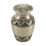
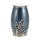
Two useful terms here: 'keepsake urns'—small vessels for sharing ashes among family—and 'cremation jewelry,' like necklaces that hold a pinch of remains. These items bridge emotion and practicality, helping families keep memories close without overwhelming the day.
So, as you weave in modern elements, remember: clarity, not clutter. If the extra touches feel like a comfort, they belong. If they're confusing, scale back.
Designing for Readability: Format, Paper, and Digital Sharing
Let’s get practical now—because all the thoughtful content in the world won’t matter if your guests can’t read it. A memorial program’s biggest asset is readability. Think about it: older guests, dim lighting, maybe even tears. A font size of 11 or 12 points isn’t just a design choice; it’s an act of kindness.
You may be asking, 'Does it really matter if I use two fonts instead of five?' Absolutely. In print design, 'font family' means a set of matching styles that create harmony, not chaos. Stick to one or two, use bold for section labels, and let white space do the heavy lifting. Matte paper cuts down glare, which is a real help in sunlit chapels or candle-lit rooms.
For digital sharing, export as a clean PDF, with a clear filename like 'Memorial Program – [Name] – [Date].pdf.' Test it on your phone before sending it out. Digital accessibility is as important as print legibility—QR codes should scan easily, and links need to work before you hit print.
Here’s a tip: view your program as both a guide and a memento. Imagine a guest reading it on the day, then tucking it in a drawer for years. Does it feel steady, not heavy? If so, you’ve done your job.
Remember, the best memorial program isn’t the most elaborate—it’s the one that helps people show up, follow along, and honor well. That’s design with compassion at its heart.
“Thanks for listening. Visit Funeral.com for memorial resources and thoughtful keepsakes, and follow us for more episodes. We’re grateful you’re part of this community.”
Read the full article here: How to Write a Memorial Program: What to Include and What to Skip


