


Most families don’t walk into a cemetery thinking about typography. They walk in thinking about a person. And then, somewhere between the quiet rows and the practical conversations with a cemetery office or monument company, the reality lands: the inscription has to work. It has to be readable on a bright day and on a gray day. It has to be legible to older relatives who may be visiting with tired eyes. It has to make sense from a few steps back, not only when you’re standing close enough to trace the letters with your fingers.
This is why headstone font choices and headstone layout and line breaks matter more than people expect. The goal is not to “design” grief. The goal is to make sure the memorial is clear, dignified, and true—so the name, the dates, and the few chosen words can be found and understood for decades.
If you’re early in this process and the terminology already feels confusing, Funeral.com’s guide What Is a Headstone, Exactly? Definitions, Types, and Cemetery Rules in Plain English can help you feel grounded before you make any permanent decisions.
Why Readability Is the Most Loving Design Choice
Families sometimes worry that choosing a simpler font or a more straightforward layout will feel “plain,” as if clarity is the enemy of personality. In practice, readability is often the thing that makes a memorial feel tender rather than frustrating. When the inscription is easy to read, visitors don’t have to work. They can just be present.
This is especially important if you’re thinking about large print for older eyes. In many families, the people who will visit most are also the people who need the most legibility—parents, grandparents, older siblings, longtime friends. A design that looks elegant on a computer screen can become surprisingly hard to read once it’s carved into stone, exposed to sun, weather, and time.
And because cemetery rules often influence lettering style and spacing, it’s wise to look at the “real-world” constraints early. Funeral.com’s article Headstone Regulations and Cemetery Rules: Size Limits, Materials, and What’s Allowed explains why some designs get approved easily while others require revisions—and how to avoid delays that add stress when you’re already carrying enough.
“Best Fonts for Gravestones” Usually Means “Best for This Stone, This Setting, This Distance”
When families search for the best fonts for gravestones, they are usually trying to answer a more practical question: “What will still be readable years from now?” The honest answer is that the “best” font depends on the memorial type (upright, slant, flat marker, bronze plaque), the finish of the material, and how much information you need to fit.
Even the style of marker changes what “readable” means. Flat markers often need stronger contrast and simpler letterforms because they sit low to the ground and collect debris. Upright stones are more visible from a distance, but they can also create shadows that either help or hurt legibility depending on the engraving and the sun angle. If you’re still deciding what kind of memorial you’re ordering, Types of Headstones and Grave Markers: Materials, Styles, and How They Age gives a clear, practical overview that pairs well with inscription planning.
Block, serif, and script: what the style actually communicates
The most common decision families face is script vs block lettering on headstones, often with a third category in the middle: serif lettering (classic, traditional letterforms with small finishing strokes).
Block lettering is straightforward and tends to be the most readable at a glance. It’s often a strong choice for names and dates, especially if the memorial is a flat marker or if visitors will be reading from a standing position a few feet away. Block styles also hold up well when the inscription includes multiple lines, because the letters remain clear even when the font size must be slightly reduced to fit.
Serif lettering often feels “classic” in a way many families associate with older cemeteries and traditional monuments. Serif styles can be very readable, especially when the stone is upright and the engraving is deep and crisp. If you’re trying to balance dignity and warmth without sacrificing clarity, serif styles are frequently the quiet compromise.
Script lettering can be beautiful, but it’s the most vulnerable to readability issues—especially on smaller stones, crowded layouts, or when the script includes thin strokes and elaborate flourishes. Many families choose script for a short phrase (an epitaph, a nickname, a single line of sentiment) while keeping the name and dates in a more readable block or serif style. This creates a hierarchy: the essentials are clear, and the personal touch is still there.
Layout Comes First: The Hidden Power of Spacing and Line Breaks
It’s easy to think the inscription is “the words,” but the experience of reading a headstone is shaped by how those words are arranged. A well-designed layout guides the eye naturally. A crowded layout makes visitors squint, lean in, and sometimes miss details that matter.
In practical terms, headstone layout and line breaks should do three things: create a clear hierarchy, make scanning easy, and leave breathing room so the memorial doesn’t feel visually heavy.
Hierarchy: what you want people to see first
Most inscriptions naturally fall into layers: the name, the dates, and then whatever else you choose to include (a relationship line, a short phrase, a religious or cultural expression, a symbol). The name is usually the anchor. If the name competes with too many other lines of text, the memorial can look busy even when the words are meaningful.
One approach that works well is to treat the name as its own “center of gravity,” then keep supporting lines slightly smaller or simpler. That doesn’t make the other words less important; it simply makes them easier to absorb.
Line breaks: where meaning gets clearer or muddier
Line breaks are not only about fitting text onto a stone. They change how a phrase reads. A thoughtful line break can make a short epitaph feel calm and balanced. A careless line break can make the same words feel cramped or awkward.
Consider the difference between these two layouts:
BELOVED FATHER AND FRIEND
JAMES A. WILSON
1952–2025
JAMES A. WILSON
BELOVED FATHER
AND FRIEND
1952–2025
Neither is “wrong,” but the first keeps “Beloved Father and Friend” as one complete thought, which many people find easier to read. The second creates emphasis by separating “Beloved Father” and “And Friend,” which may feel more personal—or may feel choppy depending on your intent. This is why a proof matters: you’re not only checking spelling. You’re checking how the memorial speaks.
How Crowding Happens, and How to Prevent It
Families rarely set out to create a crowded inscription. Crowding usually happens because you keep adding meaningful details—middle names, nicknames, military service, relationship roles, a long quote—without realizing how quickly space disappears once the words are carved.
If your main concern is avoiding crowded inscriptions, it helps to make two lists in your mind: what is essential, and what is optional. Essential is usually the legal name (or the name they were known by), and accurate dates. Optional is everything else. Optional doesn’t mean unimportant. It means you may express it in a different way if space gets tight.
Sometimes families solve this by choosing a larger memorial. Sometimes they solve it by tightening the wording. And sometimes they solve it by pairing a simple cemetery marker with a more personal, flexible memorial at home.
This “paired memorial” approach is increasingly common, in part because disposition trends have shifted. According to the National Funeral Directors Association (NFDA), the U.S. cremation rate is projected to be 63.4% in 2025, compared with a projected burial rate of 31.6%. According to the Cremation Association of North America (CANA), the U.S. cremation rate was 61.8% in 2024. When more families are choosing cremation, more families are also finding themselves balancing “public” memorial choices (markers, plaques, shared spaces) with “private” ones (home displays, keepsakes, personal rituals).
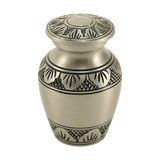
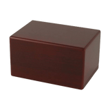
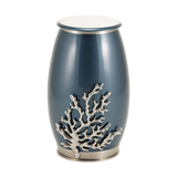
This is where options like cremation urns and cremation urns for ashes can become part of the story, even in an article about headstones. Many families choose a cemetery marker that is simple and readable, then create a more personal memorial at home using a primary urn from Cremation Urns for Ashes and, if they want to share or keep a portion separate, smaller options like Small Cremation Urns for Ashes or Keepsake Cremation Urns for Ashes.
Symbols, Borders, and Decorative Elements: When Less Is More, and When More Is Meaningful
Families often ask about adding symbols and borders because images can say what words cannot. A small emblem can communicate faith, profession, military service, family role, or a personal passion in a way that doesn’t require extra lines of text.
Symbols can also support readability by giving the eye a “rest” between lines. A simple divider line, a small icon, or a modest border can create structure and balance—especially on larger stones where too much empty space can make the design feel unfinished.
The key is to treat symbols as part of the layout, not an afterthought. Ask how the symbol will be engraved, how it will age, and whether the cemetery has restrictions on images. If you want inspiration or you’re trying to understand what certain icons mean, Headstone Symbols and Icons: Common Images and What They Mean is a helpful companion read.
Proof Review: The Moment That Prevents Heartbreak
There is a point in this process that deserves more attention than it usually gets: reviewing a headstone proof. Families are often exhausted by the time a proof arrives. The instinct is to glance quickly, approve it, and move on. But the proof is where you catch the mistakes that become permanent if you miss them.
Think of the proof as both a spelling test and a clarity test. You’re checking accuracy, but you’re also checking whether the layout reads the way you intend it to read—especially from a distance.
- Verify spelling of every name, including middle initials, suffixes, and nicknames.
- Confirm dates, including the format (month/day/year vs day/month/year) and punctuation.
- Check line breaks and spacing, looking for awkward splits or cramped lines.
- Look closely at punctuation and special characters (apostrophes, hyphens, accent marks).
- Confirm symbol choices and placements, and whether they align with cemetery rules.
- Ask how the final engraving will look on the chosen material and finish, especially if contrast is a concern.
These are not fussy details. They are the practical side of love. If you want help choosing words that fit in real space, Funeral.com’s Beautiful Words for Headstones: Epitaph Examples, Phrases, and How to Choose the Right One can help you write something meaningful without accidentally creating a layout that forces the lettering to shrink into illegibility.
Working With a Monument Designer Without Losing Your Voice
Many families feel hesitant about working with a monument designer because they worry they’ll be pressured into something expensive or ornate. A good designer is not there to upsell you. They’re there to solve practical problems you might not know exist yet—how the engraving will hold up, how much space you truly have, how to balance aesthetics with readability, and how to meet the cemetery’s requirements without constant back-and-forth.
You can make this collaboration easier by coming in with a few anchored decisions: what kind of memorial the cemetery allows, what the essential inscription elements are, and what level of simplicity feels right for your family. From there, let the designer translate your intent into a layout that will last.
If you’re choosing a marker in a section with strict regulations, it may help to read Headstone Regulations and Cemetery Rules first, so you’re speaking the same language as the professionals you’re working with.
When Cremation and Headstones Overlap: Markers, Niches, and “What to Do With Ashes”
Even when a family chooses cremation, a headstone or marker may still be part of the plan. Some families inter ashes in a cemetery plot with a marker. Some place an urn in a columbarium niche with a plaque. Some choose scattering and still place a cenotaph (a memorial marker without remains) so future generations have a place to visit.
If you are navigating this intersection, it helps to approach it as funeral planning rather than a single purchase. You’re deciding how remembrance will live in both public and private spaces. Funeral.com’s guide How to Choose a Cremation Urn That Actually Fits Your Plans is useful here because it starts with the real scenario—home, burial, scattering, travel—then helps you select the right type of urn for that scenario.
If your family is considering keeping ashes at home for a period of time (or permanently), Keeping Ashes at Home: How to Do It Safely, Respectfully, and Legally offers practical guidance that many families find calming. It’s also where “memorial choices” become more tangible: a home display may include a primary urn, a photo, a candle, and perhaps a shared keepsake.
For families who want a personal connection that moves with them, cremation jewelry can be part of the plan. Options like Cremation Jewelry and Cremation Necklaces are designed to hold a small portion of ashes. If you want a clear, no-pressure explanation of how it works, Cremation Jewelry 101 is a strong starting point. In this context, a cemetery marker can remain simple and readable—while the more personal story is carried privately, day to day, through a keepsake.
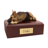
And for families making memorial decisions after a pet loss, many of the same readability principles apply to plaques, garden stones, and engraved keepsakes. Collections like Pet Cremation Urns for Ashes, Pet Figurine Cremation Urns for Ashes, and Pet Keepsake Cremation Urns for Ashes reflect the same underlying need: clarity, dignity, and a tribute that feels like them. If you’re sorting through those options, Pet Urns for Ashes: A Complete Guide for Dog and Cat Owners walks through the practical decisions with a gentle tone.
Sometimes, families ask about water burial as part of a scattering plan, especially when the person loved the ocean, lakes, or boating. If that’s on your mind and you’re trying to understand what a water ceremony looks like (and what types of urns are used), Understanding What Happens During a Water Burial Ceremony can help you picture the process.
Cost, Clarity, and Avoiding Regret
At some point, nearly every family asks a practical question that carries emotional weight: how much does cremation cost, and how much should we budget for the memorial pieces that come after? The answer varies by location and service level, but what matters most is that you don’t get trapped by surprise expenses—cemetery fees, installation costs, engraving add-ons, or rushed decisions.
If cremation is part of your plan and you’re trying to build a realistic budget, Funeral.com’s How Much Does Cremation Cost? Average Prices and Budget-Friendly Options explains the big categories in plain language and helps families plan for the “extras” without shame or pressure.
And if your question is broader—what to do with ashes when different family members want different things—remember that many families create layered plans. One urn can be the “main” resting place, while a few small keepsakes allow others to feel close. That’s where options like small cremation urns, keepsake urns, and cremation necklaces often come into the picture, not as a sales tactic, but as a practical way to honor multiple grief styles within one family.
The Final Check: A Memorial That Will Still Speak Clearly Years From Now
The most important design question is not “Is it trendy?” It is “Will it still be readable, still feel respectful, and still represent them when time has passed?” That is why the “small” decisions—font style, spacing, line breaks, proof review—deserve more patience than families are usually given.
If you are still deciding what kind of cemetery memorial you want, it can help to browse Most Popular Types of Headstones Today to get a clearer mental picture. If you are choosing words and need help fitting them into real space, the epitaph guides and symbol guides can keep you from getting stuck. And if cremation is part of your family’s plan, remember that memorialization is not one decision—it is a set of decisions that can be shared across places and time.
In the end, a readable inscription is a gift to everyone who will visit. It says, quietly and clearly: this life mattered, this name belongs here, and you are not alone in remembering.


