






The Meaning of Blue in Grief and Memorials
Hey everyone, welcome back to the funeral.com podcast! Picture this: you're walking into a room filled with a mix of muted blues, warm wood tones, and soft candlelight. How does it make you feel? Calm? Grounded? There's something about colors that speaks to us without words, isn't there? And in times of grief, those unspoken feelings are more powerful than ever.
So, let's talk about blue—specifically, how it becomes a safe haven for so many during hard times. Fun fact: blue is one of the most commonly chosen colors for sympathy flowers, memorial programs, and keepsakes. Why? It’s tied to things that feel steady, like a clear sky or a calm ocean. But here’s the kicker—blue is also the color of sadness, of 'feeling blue.' That duality makes it unique. It doesn’t demand happiness, but it also doesn’t overwhelm you with sorrow.
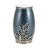
I remember a friend who lost her grandfather. She chose a navy blue urn for his ashes because it reminded her of the suit he wore to her high school graduation. It wasn’t just about the color—it was about the memory it sparked. That’s the thing about blue. It’s not just a color; it’s a connection to something personal.
But, you know, not everyone feels the same way about colors. Some people might find blue too cold or distant, especially in a memorial setting. And that’s totally valid! Color psychology isn’t one-size-fits-all. It’s influenced by culture, personal experiences, and even the lighting in a room. So, while blue might feel calming to some, it could feel isolating to others.
Here’s a thought to carry forward: when you're choosing colors for a remembrance or even just your own space, think about what they mean to *you*. How do they make you feel? What memories do they evoke? Blue doesn’t have to be a universal 'calm'—it just has to feel right for the moment you're creating.
Blue in Memorials: Shades and Symbolism
Alright, let’s dive deeper into how different shades of blue can shape a memorial. Did you know that even slight variations in color can completely change how a space feels? For example, navy blue often evokes dignity and tradition, while light blue feels airy and comforting—like a gentle breeze on a summer day. And then there’s teal, which has this unique blend of calm and energy that feels almost healing.
A family I know chose a cobalt blue urn for their son. He had been a painter, and cobalt was his favorite color to use in his art. It wasn’t a typical 'mourning color,' but it brought so much life to the memorial. It was like they were honoring his creativity and energy, not just his absence.
Now here's an interesting tidbit: blue is often seen as the opposite of red in color symbolism. Red is linked with war and urgency, while blue is associated with peace and stability. That’s why the United Nations flag is blue—it’s meant to symbolize peace. But, we have to be careful not to overuse it. Too much blue in a space can feel cold or clinical without some warmth to balance it out.
So, when you’re planning a memorial, think about the shades of blue as a 'mood dial.' Want something formal? Go with navy. Looking for lightness? Sky blue might be your friend. And if you want to mix calm with vitality, teal or turquoise could be the way to go. It’s less about what society says about the color and more about what feels authentic to your story.
And here’s the forward-looking piece: as we continue to personalize memorials, we’ll likely see even more creative uses of color. Who says a memorial has to look a certain way? Maybe your loved one’s favorite shade will guide your choices, or perhaps you’ll break tradition entirely. Either way, let color be your ally in expressing love and memory.
The Role of Blue in Religious and Spiritual Contexts
Have you ever noticed how often blue shows up in religious and spiritual art? It’s one of those colors that seems to bridge the earthly and the divine. In Christian art, for example, blue is often used to depict the Virgin Mary. It symbolizes purity, devotion, and constancy. But it’s not just Christianity—blue appears across cultures as a color of protection, blessing, and sacredness.
I once visited a temple that had these stunning blue tiles covering the walls. The guide explained that the blue was meant to mimic the heavens, creating a connection between the earthly and the divine. Standing there, surrounded by that deep, celestial blue, I felt this incredible sense of peace and awe. It’s amazing how color can do that.
That said, not everyone connects with blue in the same way. Some people might find its spiritual symbolism a bit abstract or even irrelevant. And that’s okay! Spirituality is deeply personal, and what comforts one person might not resonate with another. The key is finding what feels sacred to you.
Looking ahead, I think we’re going to see more people embracing the spiritual meaning of colors in their own unique ways. Whether it’s incorporating blue into a memorial service, wearing a blue piece of cremation jewelry, or even just lighting a blue candle at home, these small gestures can have a big emotional impact.
So, if you’re drawn to blue—whether for its spiritual resonance or its calming effect—lean into that. You don’t need to explain it to anyone. Sometimes, the choices that feel the most right are the ones we can’t fully put into words.
Practical Uses of Blue in Grief and Memorialization
Finally, let’s talk about the practical side of things. How can you actually use blue in memorials, gifts, or even everyday remembrance? One practical tip: darker blues, like navy or cobalt, are great for items that get frequent handling, like urns or keepsakes, because they hide fingerprints and scuffs better. Lighter blues, on the other hand, can brighten a space, especially smaller rooms or apartments.
A family I know chose a sky-blue keepsake urn for their grandmother. They kept it on a shelf near a window where the sunlight would catch it just right. It wasn’t just an urn—it became a little moment of beauty in their day-to-day life. That’s the power of thoughtful choices.
But here’s the flip side: some people worry that blue might feel 'too sad' or 'too cold' for a memorial. And that’s a valid concern! If that’s your hesitation, consider pairing blue with warmer tones—like wood, candlelight, or even gold accents. It’s all about balance.
Looking ahead, I think we’re going to see more families using color intentionally, not just as an afterthought. Whether it’s a blue cremation necklace you can wear close to your heart, a water burial that returns your loved one to the sea, or even just a blue candle you light at night, these choices can be deeply personal and healing.
Alright, that’s all for today’s episode. Thanks for tuning in, and remember: whether it’s blue, red, or any color in between, choose what feels right for you. See you next time!


