


If you’ve ever paused over a paint swatch, a bouquet, or a piece of stationery and wondered what color represents peace, you’re not alone. People reach for “peace colors” when they want a room to feel calmer, a brand to feel steadier, or a memorial to feel gentle instead of heavy. The question is deceptively simple, because peace isn’t one emotion. Sometimes it means quiet. Sometimes it means safety. Sometimes it means reconciliation after conflict. And sometimes it means the kind of softness you crave when you’re grieving and trying to make decisions that still feel unreal.
That’s why the color of peace can look different across cultures, faiths, and family traditions. A shade that feels comforting in one community might feel formal, clinical, or even sorrowful in another. The best approach is to treat color as a language you can adapt. This color symbolism guide will walk through the most common answers to what color symbolizes peace—especially blue, white, and green—while giving you practical ways to build a peaceful color palette for memorials, home décor, and visual design.
Why Peace Colors Matter More Than People Expect
Color does two things at once: it communicates meaning, and it shapes how a space feels. That’s why people often turn to calming colors when they’re doing funeral planning or designing a remembrance moment. In grief, you’re already processing so much—logistics, family dynamics, memories, and the shock of absence. A thoughtful palette can create a quiet “container” for the day, whether that’s a memorial service, a celebration of life, or a small gathering at home.
Color also helps when you’re trying to make choices that need to work together—flowers, clothing, printed programs, candles, and any keepsakes you plan to keep long-term. For families choosing cremation, that can include cremation urns, cremation jewelry, and small objects that will live in your home for years. When those pieces feel visually coherent, many people describe it as a sense of relief: one less thing that feels chaotic.
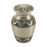
Blue: The Peace Color Most People Recognize Instantly
If you ask ten people what color symbolizes peace, you’ll hear “blue” more often than any other answer. There are cultural reasons for that, but there are also modern, widely shared associations: blue feels like open sky, deep water, and steadiness. It’s the color many people reach for when they want to communicate trust, stability, and calm. In everyday language, you even hear it in phrases like “feeling blue,” which points to how strongly color and emotion get linked in our minds.
There’s also a high-profile global example that shaped modern symbolism. In the United Nations’ emblem guidelines, the organization notes that “UN blue” was chosen because blue represents peace in opposition to red for war. If you’ve ever thought the UN flag feels calming, that’s not an accident; it was designed to signal diplomacy and shared purpose.
From a psychology standpoint, blue is frequently described as tranquil and relaxing. That doesn’t mean it works the same way for everyone, but it helps explain why “blue” shows up so often when people search blue meaning peace. If you want blue to feel peaceful rather than cold, the tone matters. Dusty blues, soft navy, and muted teal-leaning blues often read as calmer than bright, high-saturation blue. In floral design, blue can be especially soothing when it’s paired with warm neutrals (cream, sand, soft gray) instead of stark white.
Using Blue in Memorials Without Making It Feel Somber
Blue can be a beautiful anchor for memorial colors because it photographs well, prints consistently, and works across seasons. Families often use blue in a few gentle ways: a ribbon on a framed photo, blue-hued candles, navy or slate attire, or subtle blue accents in programs and signage. If you’re building a home memorial, blue can be especially comforting in the background—think a vase, a throw blanket near a remembrance shelf, or a small piece of art that feels like “quiet water” rather than “dark sadness.”
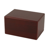
If your plans include cremation, you may find it comforting that color choices don’t have to be purely symbolic; they can also be aesthetic. Many families choose cremation urns for ashes in hues that match the home—sometimes a deep blue, sometimes a soft neutral with blue accents—so the urn can be present without feeling visually jarring. If multiple relatives want a portion of the remains, keepsake urns make it easier to keep the palette consistent across several small memorials.
White: Peace as Simplicity, Truce, and “Nothing to Prove”
White often appears in conversations about white peace symbolism because it communicates restraint. White can mean “I’m coming without threat,” “I’m not escalating,” or “I’m willing to pause.” That’s part of why the white flag is widely recognized as a symbol of truce, and why international humanitarian law addresses the protection tied to a flag of truce. In design terms, white is space. It’s breathing room. It’s a visual way of saying, “Let this moment be uncomplicated.”
In memorial settings, white is also practical. It works with every other color, it’s easy to build around, and it can feel respectful without feeling heavy. That said, white is not universally “simple.” In some cultures, white is closely associated with mourning rather than peace, which is one reason it’s worth thinking about the family’s traditions before you decide that white automatically means calm. Even within the same community, some people experience white as clean and hopeful, while others experience it as stark or empty.
How to Make White Feel Warm, Not Clinical
If you want white to feel peaceful rather than sterile, soften it. Cream, ivory, oatmeal, and warm off-white tend to feel more human than bright, pure white. Texture helps too: linen, matte paper, unglazed ceramics, and natural wood all “warm up” a white-heavy palette. In a home memorial, white flowers paired with greenery often feel gentler than a fully white arrangement, because the green adds life and dimension.
For families choosing cremation, white can also be a way to keep focus on the person rather than the objects. Some people choose a light-toned urn from collections like small cremation urns for a quiet shelf display, especially when they’re keeping ashes at home and want the memorial to feel integrated into daily life rather than set apart like a shrine. If you’re exploring that choice, the practical guide Keeping Ashes at Home can help you think through placement, household comfort, and respectful handling.
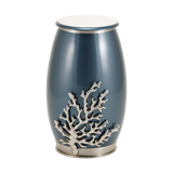
Green: Peace as Renewal, Nature, and the Olive Branch
When people search green peace meaning, they’re often reaching for a specific kind of peace: the kind you feel outdoors, the kind that comes with breathing deeper and remembering your body is still here. Green is strongly tied to nature, growth, and continuity. It can also point to reconciliation and goodwill through one of the oldest peace symbols still in use: the olive branch. In everyday language, “extending an olive branch” is a shorthand for making peace, and that symbolism is woven into many modern images of diplomacy.
In memorial design, green can be especially healing because it doesn’t insist on one emotion. It can hold sorrow and hope at the same time. That’s why many families incorporate green through live plants, eucalyptus, ivy, rosemary, or simple leafy arrangements. Green also works well when you want a palette that feels grounded and not overly “event-like.”
Green in Pet Memorials
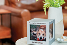
Green can be a gentle choice for pet loss, because it echoes the everyday life you shared: walks, backyard moments, sun on the grass, the rhythm of ordinary companionship. Families looking for pet urns often want something that feels like home rather than a “product,” and color plays a role in that. Options like pet urns for ashes come in styles that can blend into a bookshelf or bedside table, while more sculptural pieces like pet figurine cremation urns can reflect a pet’s personality in a way that feels tender and specific. If you’re sharing a small portion of ashes among family members, pet keepsake cremation urns can help you keep the look consistent while still giving each person their own space for remembrance.
Beyond Blue, White, and Green: Other Colors That Can Signal Peace
One reason people keep asking what color represents peace is that they’re hoping for a single correct answer. In reality, peace is often a palette rather than a point. Depending on context, other colors can carry peaceful meaning too—especially when they’re softened or used as accents.
Soft gray can feel peaceful because it refuses drama. It’s neutral, steady, and often reads as modern and gentle. Lavender and muted purple can feel peaceful in a “spiritual quiet” sense, especially in spaces designed for reflection. Pale pink can feel peaceful when it’s more blush than bright, suggesting tenderness and care. Even warm sand, taupe, and soft gold can read as peace when they create a sense of warmth and safety rather than celebration or luxury.
If you’re working in brand visuals, “peace” can mean approachability and trust—colors that feel safe to engage with. If you’re working in memorial design, “peace” can mean something slightly different: a palette that doesn’t fight the moment, and that leaves room for grief to exist without being pushed around by the décor.
How to Build a Peaceful Color Palette for Memorials and Home
When you’re choosing memorial colors, the goal usually isn’t perfection. It’s coherence and comfort. Start by thinking about the feeling you want the space to hold: quiet and airy, warm and grounded, natural and outdoorsy, or soft and intimate. Then choose one anchor color, one neutral, and one accent. That’s often enough.
- Quiet blue palette: dusty blue + warm ivory + soft gray
- Nature-forward palette: sage green + cream + light wood tones
- Minimal and luminous palette: off-white + pale gray + subtle gold accent
- Soft comfort palette: muted teal + sand + blush accent
In memorial settings, you can apply the palette lightly. A single accent color can show up in flowers, table linens, or a ribbon on a frame. A neutral base can carry everything else. If you’re choosing objects that will remain in the home—like an urn or jewelry—many families find it helpful to decide the home palette first, then choose memorial items that naturally fit within it.
Where Peace Colors Meet Practical Decisions in Funeral Planning
Even when the article topic is color, many families are also trying to answer bigger questions at the same time: what to do with ashes, whether keeping ashes at home will feel comforting or difficult, or whether a scattering ceremony is the right fit. These choices affect design in a real way, because the location and plan shape what you’ll actually use.
According to the National Funeral Directors Association, the U.S. cremation rate was projected at 63.4% for 2025, with continued growth expected. The Cremation Association of North America also reports a majority cremation rate in recent national statistics. One reason those numbers matter for design is simple: when cremation is common, families often build more personal, home-centered memorials, and color becomes part of making those spaces feel livable.
If you’re exploring urn options, you might start with a broad look at cremation urns for ashes, then narrow based on whether you want a full-size urn, a sharing plan, or something smaller that fits a shelf or niche. How to Choose the Best Cremation Urn can help you connect the practical choices (size, placement, materials) to the emotional ones (what feels right for your family).
Peace Colors and Water Burial
For some families, “peace” is tied to water—an ocean horizon, a lake where someone felt most themselves, a shoreline where grief can breathe. If you’re considering water burial or burial at sea, the palette often shifts naturally toward blues, sea-glass greens, soft grays, and sandy neutrals. It’s also one of those moments where practical rules shape the plan. The U.S. Environmental Protection Agency explains that burial at sea for cremated remains must take place at least three nautical miles from land, which affects how families schedule and experience the ceremony.
If the words themselves feel confusing—because people use “water burial” to mean different things—the guide Water Burial and Burial at Sea can help you sort out what you’re envisioning and what your options actually are, without turning it into a sales pitch or a checklist you have to power through.
Cremation Jewelry as a Peaceful “Always-With-You” Choice
Sometimes peace is not a color at all—it’s access. It’s knowing you can reach for a small comfort on a hard day. That’s one reason cremation jewelry has become such a meaningful option for many families. A necklace or pendant can hold a tiny portion of ashes and let someone carry remembrance quietly, without explanation.
If you’re exploring cremation necklaces, color can matter here too. Silver and steel often read as calm and minimal. Black can feel grounding. Soft gold can feel warm and familiar. If you want jewelry to match a peaceful palette, you might start with the cremation jewelry collection, or browse cremation necklaces specifically. And if you want a practical explanation of how these pieces work (including filling and care), Cremation Jewelry 101 is designed to make the process feel less intimidating.
Choosing Peace Colors That Actually Fit Your Person and Your Life
If you take nothing else from this, let it be this: a peaceful palette is allowed to be personal. The “right” answer to what color symbolizes peace is the color that makes your shoulders drop when you see it, the color that feels like permission to exhale. For some people, that’s blue. For others, it’s green. For others, it’s a soft neutral that doesn’t demand attention.
When you’re choosing memorial colors, it can help to ask a few gentle questions: What did they wear when they felt most like themselves? What places made them feel safe? What colors already live in your home, so the memorial can belong instead of standing apart? The best color choices don’t perform peace for other people. They support peace for you.
And if you’re making decisions that extend beyond color—urn selection, jewelry, scattering plans, or the broader arc of funeral planning—you don’t have to solve everything in a single day. Many families make one practical decision first, then come back to the design details when the shock has eased. Peace, in real life, is often built in small steps.
Whether your palette is blue and ivory, green and cream, or something entirely your own, the goal is the same: to create a space where love can be remembered without being overwhelmed. In that sense, the most meaningful “peace color” is the one that helps you keep going—softly, steadily, and with room to breathe.


