
Blue is one of those colors that feels like it already has a story before you say a word. A soft sky blue can make a room breathe. A deep navy can feel formal and anchored. A gray-blue can read as quiet, distant, even tender. That flexibility is exactly why the meaning of blue in art is so layered—and why blue shows up again and again in paintings, design, and modern memorial spaces. If you have ever stood in front of a blue-toned artwork and felt your shoulders drop, you have already experienced what artists have been harnessing for centuries: blue can create emotion without asking you to explain it.
That emotional range matters in real life, too. Families who are planning a service, arranging cremation, or choosing a memorial often end up making design decisions they never expected to face. And because cremation is now the majority choice in the United States—projected at 63.4% in 2025, according to the National Funeral Directors Association—more people are creating memorial “centers” at home, choosing cremation urns for ashes, and deciding what feels right for a long-term tribute. In that setting, blue is often chosen not because it is trendy, but because it can hold complicated feelings: love, grief, steadiness, and peace.
Blue as a Visual Language: Calm, Distance, Melancholy, and Authority
When people ask, what does blue represent, they are usually asking about mood. In color psychology conversations, the psychology of blue is commonly associated with calm, trust, and reflection—but art adds nuance. Blue can suggest the infinite (sky and sea), the sacred (halos, robes, illuminated manuscripts), or the interior world (thought, longing, solitude). In other words, blue color symbolism is less like a single definition and more like a vocabulary: the meaning changes with context, light, and the colors around it.
One practical reason blue works so well is that it can create perceived depth. Artists and designers use blue to push things “back” in space—think horizon lines, atmospheric haze, or a cool shadow that makes a warm highlight pop. That spatial effect is part of why blue can feel like distance, memory, or time. It also explains why blue is so effective in visual storytelling: it can imply what is out of reach without making the scene feel empty.
Why Blue Became Sacred: Pigment, Symbol, and the Weight of Meaning
Some of the strongest associations around blue come from how difficult it once was to make. The “blue” in a painting was not a generic tube of paint—it was a material with a history. The National Gallery of Art notes that ultramarine was historically made from lapis lazuli and, for centuries of Western art, was reserved for painting the Virgin Mary’s cloak. That tradition shaped how viewers read blue: not only as a color, but as a signifier of reverence, protection, and spiritual authority.
You can see this reverent use of blue in countless devotional works, and museums still call it out because it mattered economically as well as symbolically. In its discussion of Sassoferrato’s “The Virgin in Prayer,” the National Gallery, London explains that the brilliant blue is ultramarine—an extremely expensive pigment made from lapis lazuli. Even if you are not studying art history, that detail helps explain why blue can feel “serious” in art. It earned its gravity.
Famous Uses of Blue in Paintings: When Color Becomes a Mood
If you want a clear example of blue being used as emotional architecture, Picasso’s early years are unavoidable. The Metropolitan Museum of Art describes Picasso’s Blue Period (late 1901 to about mid-1904) as paintings that depict themes of poverty, loneliness, and despair, and the Musée national Picasso-Paris connects the blue-tinted works with deep melancholy in the wake of personal loss. This is one of the clearest answers to “blue equals sadness” you will find in art history—but it is not shallow sadness. It is contemplative, human, and close to the bone.
Blue can also be used not to describe grief, but to gesture toward the infinite. That is part of why Yves Klein’s signature blue still feels modern decades later. In a piece on the origin of International Klein Blue, the Centre Pompidou notes that Klein patented the formula for an intense ultramarine blue in 1960 and used it as a symbol of immateriality and the infinite. In Klein’s work, blue is not a background—it is the subject. It becomes space.
These two examples—Picasso’s sorrow and Klein’s infinity—show why blue in paintings is so powerful. Blue can speak about the hardest human experiences without getting literal. It can say “this is heavy” or “this is vast” and let the viewer fill in the rest.
Shades of Blue Meaning: The Same Color, Different Stories
When you are choosing blue for a space, a brand, or a memorial element, the shade matters more than most people expect. Shades of blue meaning is where the conversation gets practical. A single “blue” is rarely just blue; it carries temperature, saturation, and brightness, and each one pushes the emotional read in a different direction.
- Sky or powder blue often feels gentle, open, and hopeful—useful when you want calm without heaviness.
- Cerulean and ocean blues can feel cleansing, expansive, and nature-linked, which is why they show up in coastal imagery and water-themed remembrance.
- Navy and midnight blues tend to read as formal, grounded, and enduring—often chosen for ceremonies and “legacy” messaging.
- Teal and blue-green shades usually feel restorative and modern, especially when paired with warm neutrals or natural wood.
In design terms, blue also changes quickly based on what sits next to it. Put blue next to crisp white and it can feel fresh. Put it next to charcoal and it can feel solemn. Put it next to gold and it can feel ceremonial. If you are using blue to communicate something important—like remembrance—you are not only picking a color. You are setting a tone.
Blue in Memorial Design: When Art Principles Meet Real Life
People do not usually plan a memorial because they want a design project. They do it because they want a tribute that feels honest. That is why color can be surprisingly helpful: it offers a way to express love and personality when language is hard. Blue is especially common in memorial choices because it can be calm without feeling cheerful, and reflective without being stark.
If your family is in a “pause” moment—waiting for relatives to travel, deciding on a date, or still figuring out what to do with ashes—blue can be a soothing anchor for the decisions you do make now. A small home memorial might include a photo, a candle, and a single object that feels like the person. When you are ready to think about placement and long-term care, Funeral.com’s guide to keeping ashes at home walks through practical considerations in a calm, respectful way.
And because modern memorials are often built around cremation, design choices frequently connect directly to physical items: an urn on a shelf, a keepsake for a sibling, a necklace that stays close to the body. That does not have to feel salesy or transactional. It can simply be part of funeral planning—choosing objects that make daily life feel less sharp.
Cremation Trends and Why Families Are Creating More Personal Memorials
The shift toward cremation has changed what “a memorial” looks like in practice. According to the National Funeral Directors Association, cremation is projected to reach 63.4% in 2025, with a continuing rise over the coming decades. CANA’s statistics also reflect that growth: in its 2025 statistics preview (with provisional 2024 data), the Cremation Association of North America reports a U.S. cremation rate of 61.8% in 2024.
As cremation becomes more common, families are choosing a wider range of memorial approaches. The NFDA’s public statistics include a telling snapshot: among people who prefer cremation, 37.1% would prefer to have remains kept in an urn at home, 33.5% would prefer scattering in a sentimental place, and 10.5% would like remains split among relatives, among other preferences, according to the NFDA. That mix explains why keepsake urns, small cremation urns, and cremation jewelry have become so relevant. They are not “extras.” They are solutions for modern family structures, modern travel realities, and modern grief.
Choosing Blue Memorial Pieces: Urns, Keepsakes, and Cremation Jewelry
If blue speaks to your loved one’s personality—or to the mood you want the memorial space to hold—you have options that range from subtle to unmistakably artistic. Some families start broad, browsing cremation urns for ashes, and then narrow based on material, size, and placement. If the color itself is central, you can explore blue-toned designs using the blue filter for blue cremation urns for ashes.
If your plan involves sharing, travel, or a secondary memorial location, small cremation urns and keepsake urns can help you divide ashes respectfully without turning it into a stressful logistics problem. If you want a clear, scenario-based overview of materials, price ranges, and options like biodegradable choices, Funeral.com’s cremation urn buying guide is designed for exactly that moment—when you want answers without pressure.
For families who want something wearable, cremation jewelry can be a gentle bridge between private grief and daily life. Many people specifically search for cremation necklaces, and Funeral.com’s cremation necklaces collection includes options that range from minimal to engraved. If you want a practical explanation of materials, filling, and care, Cremation Jewelry 101 walks through it in plain language.
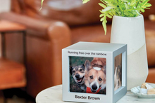
Blue also shows up meaningfully in pet memorials, where design and comfort are often intertwined. Families choosing pet urns for ashes can start with pet cremation urns, narrow to sculpture-like remembrance through pet figurine cremation urns for ashes, or choose smaller vessels meant for sharing through pet keepsake cremation urns. If you want a supportive overview of styles, sizes, and personalization, this guide to pet urns for ashes can help you feel steadier about the decision.
And if you are specifically drawn to blue as a memorial theme—the sea, the sky, a favorite color, a sense of peace—Funeral.com’s article Blue Cremation Urns: Designing a Calm, Ocean-Inspired Memorial offers gentle, practical ideas for building a tribute that feels cohesive rather than “decorated.”
Blue, Water, and “Water Burial”: A Color Theme That Can Become a Plan
Sometimes the color choice is not only aesthetic. Sometimes it points to the place a family wants to remember someone: a lake cabin, a coastline, a fishing trip, a horizon. That is where blue naturally connects to water burial planning. Families use “water burial” to mean different things—scattering on the surface or placing a water-soluble urn that dissolves—and Funeral.com’s guide to water burial and burial at sea clarifies the language in a way that prevents misunderstandings.
When the ocean is the location, federal rules matter. The U.S. Environmental Protection Agency explains that cremated remains may be buried in or on ocean waters of any depth, as long as the burial takes place at least three nautical miles from land, and that the EPA must be notified within 30 days following the event. If you are considering a biodegradable vessel for a sea ceremony, Funeral.com’s guide to biodegradable ocean and water burial urns can help you align the item with the experience you want in the moment.
Practical Tips for Using Blue in Décor, Branding, and Visual Storytelling
This is where the article returns to everyday usefulness. Whether you are designing a memorial slideshow, choosing a program background, refreshing a room after a loss, or building a brand palette, color theory blue becomes easier when you think in outcomes: What do you want people to feel when they see it?
- If you want calm and softness, use lighter blues with warm neutrals (cream, sand, light wood) rather than stark white.
- If you want dignity and formality, use navy or midnight blue with restrained accents (silver, pewter, matte black) and plenty of negative space.
- If you want an “ocean” feeling, pair blue with organic textures (linen, stone, rattan) and let the blues vary slightly so the palette feels natural.
- If you are thinking about blue branding color, treat blue as “trust” only when typography and tone support it; otherwise it can read as cold or distant.
For memorial spaces specifically, blue works best when it is chosen with intention and then kept simple. A single blue urn, a framed photo, and a small keepsake can feel complete. Too many decorative elements can make the space feel like it is trying to “perform” grief rather than hold it.
Cost, Choices, and the Quiet Relief of Clarity
Color choices sometimes feel like a detour from the “real” decisions, until you realize how much they shape the experience of remembering. That is also why cost conversations matter. When families ask how much does cremation cost, they are often trying to find stability. The NFDA reports that the national median cost of a funeral with a viewing and burial in 2023 was $8,300, while the median cost of a funeral with cremation was $6,280. Those numbers do not tell you what you will pay locally, but they do explain why many families choose cremation and then focus on creating a meaningful memorial in other ways.
If you are pricing services and trying to understand typical fees, Funeral.com’s 2025 guide on how much cremation costs breaks down what families commonly see in quotes. And if you are deciding between home placement, scattering, burial, or a combination, you can pair that information with items that feel aligned—whether that is an urn meant for display, keepsake urns meant for sharing, or a necklace meant to stay close.
Closing Thought: Blue Is Often Chosen Because It Can Hold More Than One Feeling
In art, blue is rarely just “pretty.” It can be a sacred pigment, a mood, a horizon, or a private room inside the mind. That is why blue continues to show up in the most famous works of art—and why it so often becomes part of modern remembrance. If you are choosing blue while planning a memorial, you are not being decorative. You are choosing a language that can say calm, love, and longing at the same time.
Whether your next step is exploring cremation urns, choosing pet urns, considering pet cremation urns, or looking into cremation jewelry, you deserve decisions that feel steady and personal. Blue can be that steadiness—quiet, deep, and patient enough to meet you where you are.


