


Gray tends to arrive quietly. It’s the color of early morning sidewalks, winter clouds, pencil sketches, weathered stone, and hair that has lived a whole life before turning silver. In a world that often asks you to “pick a side,” gray can feel like permission to pause—neither bright celebration nor deep shadow, but the space between. That in-between quality is exactly why people search for gray color meaning and grey symbolism when they’re trying to name something hard to name: a mood that’s calm but not joyful, steady but not loud, gentle but not sweet.
In color psychology gray, gray is often described as neutral, balanced, mature, and composed. Yet it can also read as distant, muted, or somber—especially when it’s very dark or used without warmth. The truth is that gray rarely means one thing all by itself. It changes depending on shade, texture, and context, and it changes depending on what your body has been carrying lately. When life feels overwhelming, gray can be a kind of relief: a color that doesn’t demand emotion on command.
Gray as a “between” color: balance, neutrality, and emotional breathing room
Gray sits between black and white, and that alone shapes much of its symbolism. In gray color theory, it’s typically considered achromatic—meaning it carries little or no hue. Because it doesn’t shout, it often becomes a backdrop for what matters: your words, your ritual, your memories, your art, your home. That’s why gray can feel like balance. It’s not pushing you toward a high or pulling you into a low. It’s the middle ground, the compromise, the quiet “I’m here” that doesn’t require you to perform.
For many people, gray is comforting precisely because it isn’t a verdict. If you’ve ever walked into a room painted in soft dove gray and felt your shoulders drop, you’ve experienced this firsthand. A pale gray can feel clean, airy, and open. A mid-tone gray can feel stable and practical. A dark charcoal can feel refined and protective—like a coat you pull on when the world is sharp.
But gray’s neutrality can also be misread. When a space is mostly gray and lacks warmth—no wood, no natural light, no soft fabric, no living plant—some people experience it as emotionally flat. This is one reason gray is sometimes linked to indecision or emotional distance. The color isn’t “cold” in a moral sense; it’s simply quiet. And quiet can feel safe, or it can feel lonely, depending on what you need.
Why gray can feel calming, or heavy, depending on what surrounds it
One of the most important things to understand about gray is that it’s relational. Gray absorbs the story of the colors around it. Put a warm gray next to cream and natural oak and it reads like comfort. Put that same gray next to stark white and steel and it reads like restraint. This is also why gray is a favorite in design: it allows other elements to lead, and it can shift its personality without changing its actual paint can.
Research in visual perception supports the everyday experience that our sense of a gray background can be influenced by the colors placed on top of it. In other words, gray is not just “a color,” it’s a stage—and the lighting, contrast, and saturation of neighboring colors can change what you perceive. This is part of why a gray wall can look slightly blue at night, slightly beige in morning sun, and slightly green beside a plant. Gray “takes on” what’s nearby, which makes it both adaptable and emotionally sensitive.
If you’re noticing that gray feels heavy to you lately, it may not be the gray alone. It may be the gray paired with high contrast, cool lighting, or a season of low sunlight. A simple shift—adding warm light bulbs, soft textiles, or natural materials—can turn gray from somber to soothing without repainting a single thing.
Light gray, medium gray, charcoal: how shade changes meaning
People often talk about “gray” as if it’s one color, but it’s more like a family. When someone asks what does gray represent, the most honest answer is: it depends which gray you mean.
Light gray
Light gray often symbolizes openness, simplicity, and a gentle kind of calm. It can feel like a clean slate—less stark than white, less emotionally loaded than black. In design, light gray is often used when someone wants softness without sweetness: modern, tidy, and breathable.
Medium gray
Mid-tone grays often symbolize steadiness, practicality, and maturity. They feel grounded. Many people associate this range with reliability—the color of stone, concrete, and the kind of weather that settles in without drama.
Charcoal and dark gray
Darker grays often symbolize sophistication, formality, and protection. They can also symbolize grief, seriousness, and introspection—especially when they lean close to black. Charcoal can feel like a boundary: it holds emotion without spilling it everywhere.
When gray is comforting, it’s often because it matches the emotional reality of the moment: not “fine,” not “broken,” just present. When gray is heavy, it’s often because it becomes the only emotional note in the room. The goal isn’t to banish gray; it’s to help it speak in a fuller voice.
Gray in art and design: restraint, realism, and quiet intelligence
In art, gray has long been used to create depth, realism, and atmosphere. It can suggest fog, distance, age, or memory. It can also act as a tool of restraint: a way to keep a painting from becoming sentimental, or to focus attention on composition rather than spectacle. Designers love gray for similar reasons. Gray doesn’t compete. It clarifies. It gives shape to what’s already there.
That’s also why gray is commonly associated with professionalism and seriousness—think suits, stone buildings, and minimalist devices. It signals “measured,” “considered,” and “controlled.” Yet gray can also be deeply emotional in the right hands. A charcoal sketch can capture tenderness with nothing but pressure and absence. A gray background can make a bright flower look more alive. Gray is the pause that lets other colors breathe.
A widely recognized example of gray’s modern symbolism appeared when Pantone named “Ultimate Gray” as one of its Colors of the Year for 2021, emphasizing themes like resilience and steadiness during a turbulent cultural moment. If you’ve ever felt drawn to gray when life is uncertain, you’re not alone—gray can communicate strength without aggression, stability without denial.
Gray and mood: when it mirrors your inner weather
Search terms like gray mood exist for a reason. People often describe emotional numbness, fatigue, or burnout as “gray.” It’s not always sadness. Sometimes it’s depletion. Sometimes it’s the mind protecting itself by turning down the volume. In that sense, gray can be a messenger: a sign that you need rest, softness, and fewer demands.
But gray is not only about heaviness. Many people experience gray as a comforting neutrality—especially in seasons when bright colors feel like too much. If you’re grieving, stressed, or simply overwhelmed, gray can be a gentle companion. It doesn’t insist you feel better. It doesn’t force optimism. It sits with you.
There’s also a reason gray can feel “mature.” It’s the color of experience. The silver at the temples. The stone steps worn smooth by time. The sky that has seen thousands of storms and still opens again. When you’re in a season where you need patience more than excitement, gray can feel like wisdom.
Gray in grief and remembrance: why it shows up when words don’t
In grief, color choices can feel surprisingly important. Families often don’t want a memorial to feel harsh or theatrical. They want it to feel honest. Gray can help with that. It can feel respectful without being severe, tender without being decorative. It’s one reason you’ll see gray used in modern memorial design: invitations, florals, photo displays, candlelight, and home memorial corners that are meant to feel like a quiet extension of everyday life.
Historically, mourning dress in the West was once highly codified, with expectations around color and fabric that changed over time and by relationship to the deceased. Over the centuries those strict rules loosened, but the tradition of darker, more subdued tones endured in many places. What’s notable is that mourning wasn’t always “only black.” In some contexts, muted tones—including grays—appeared as mourning customs shifted from deep mourning toward later stages and social life resumed. Gray, in that way, can symbolize transition: not the beginning shock of loss, not the return to normal, but the slow learning of how to carry love forward.
If you’re exploring how color works in memorial settings, the Funeral.com Journal’s Color & Symbolism in Grief collection offers gentle, practical guidance. You may also find comfort in Symbols of Sadness and Grief and Mourning Colors Beyond Black, which explore how families use color in a way that’s personal, respectful, and culturally aware.
How to use gray so it feels warm and intentional
If gray feels comforting to you, you can lean into it without making your space feel cold. The key is pairing gray with warmth—either through materials, light, or gentle contrast. Here are a few simple approaches that work in homes, offices, and memorial spaces alike:
- Texture over flatness: Choose linen, wool, natural wood, stone, or matte ceramics so gray has softness and depth.
- Warm undertones: Look for grays that lean beige (“greige”) rather than icy blue if you want a cozier feel.
- Gentle contrast: Pair gray with cream, soft white, or warm metals (brass, gold) to avoid a stark, clinical look.
- Natural elements: Add greenery, dried flowers, or a simple branch—nature warms gray instantly.
This same thinking applies when families choose memorial items meant to live in the home. A gray finish can blend into a bookshelf or mantel in a way that feels calm and private, especially when paired with warm accents or natural textures.
Gray in memorial choices: when families want calm, dignity, and a modern look
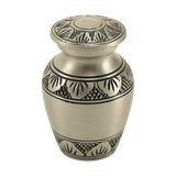
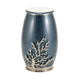
When someone is choosing cremation urns for ashes, color isn’t just aesthetic—it’s emotional. A bright color can feel celebratory for some families and inappropriate for others. Gray is often chosen when a family wants the memorial to feel composed, modern, and quietly dignified.
If you’re browsing options, Funeral.com’s cremation urns collection includes many finishes that live in the gray family—marble-inspired patterns, pewter tones, carbon enamel, and soft neutrals. A few examples that show how gray can feel different depending on material and detail include the Gray Marble Aluminum Adult Cremation Urn with Brass Accents, which leans classic and warm with metallic trim, and the Classic Vase Form Carbon Gray Extra Large Cremation Urn, which feels sleek and contemporary.
Families making memorial choices for animals often look for the same emotional tone—quiet, tender, and not overly formal. If you’re searching for pet urns and pet urns for ashes, Funeral.com’s pet cremation urns collection includes modern neutrals and designs that feel at home on a shelf or near a photo. Some families prefer memorial pieces that look like sculpture—especially when they want the urn to feel like “them” rather than a container—so the pet figurine cremation urns collection can be a gentle place to explore.
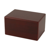
And for people who want something even more discreet, keepsake urns and small cremation urns can feel like a quieter step—especially when you’re still figuring out what to do with ashes or how keeping ashes at home might feel over time. Funeral.com’s keepsake urns collection includes many neutral styles that are easy to place in a personal corner of your home.
Some families also choose to keep a tiny portion of ashes close in a piece of jewelry. If that’s something you’re considering, cremation jewelry—including cremation necklaces—can be deeply comforting for people who want an everyday connection that feels private. Funeral.com’s cremation jewelry collection offers designs intended for secure, respectful keepsakes.
When gray is the right choice, and when you might need something else
Gray is often the right choice when you want calm, simplicity, and emotional breathing room. It works well when a space or a memorial item needs to blend into everyday life—when you want presence without spectacle. It also works when you’re in a season where you can’t tolerate bright demands. Gray can be a soft yes.
But if gray is starting to feel like a fog you can’t climb out of, that matters too. In that case, you don’t have to abandon gray—you can balance it. Add a warm lamp. Add a cream blanket. Add a piece of wood. Add a small, living green. Even a single warm accent can turn gray from “closed” to “held.”
Ultimately, the meaning of gray is not a rulebook. It’s a mirror. It can symbolize neutrality, maturity, balance, modesty, restraint, and resilience. It can also symbolize withdrawal, sadness, or uncertainty when it’s left alone without warmth. If gray feels comforting to you, that’s a form of self-knowledge. It means you’re choosing a color that meets you where you are—steady, quiet, and honest.
And sometimes, especially in grief, honest is the most comforting thing a color can be.


