
Urn engraving is one of those decisions that seems simple until you’re staring at a text box that cuts you off mid-sentence. Families often think they’re choosing “words,” but what they’re really choosing is a layout: how many lines, how many characters per line, what font style will still be readable at a small size, and where the line breaks will land once an engraver formats the design.
The goal is not to over-design grief. The goal is to avoid the most common engraving regrets: text that becomes too small to read, a script font that turns into a blur when it’s all caps, a line break that splits a phrase awkwardly, or a message that looks crowded when you wanted it to feel calm.
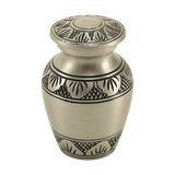
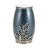
If you’re shopping on Funeral.com, two pages are worth opening in a second tab before you write anything. First, the collection of engravable cremation urns for ashes, because different urns have different engravable areas. Second, the engraving service overview, which confirms that many urns support up to six lines of custom text and that font options are available: Personalized Cremation Urn Engraving
Why Character Limits Are Not Arbitrary
Character limits exist because engraving has a fixed physical space. When you add more characters, the engraver either reduces font size, tightens spacing, or both. That is true whether the engraving is laser, rotary, or another method. Many engraving providers explain the same basic principle: more characters usually means smaller text, and smaller text is harder to read, especially on small plates or curved surfaces.
Funeral.com’s own personalization guidance for pet urns makes a practical point that applies equally well to human urns: confirm the character limit including spaces and punctuation before you fall in love with a longer phrase.
If you take one thing from this article, let it be this: the engraving “limit” is usually a readability limit, not a technical limit. You can almost always force more text onto a surface. The question is whether you’ll be happy reading it for years.
The Three Numbers to Ask For Before You Write the Wording
When a product page says “up to six lines,” that tells you the structural maximum, but it doesn’t tell you what will look good. Before you finalize your inscription, ask for three specific numbers:
- Maximum lines available on that urn or plate (and whether artwork uses one of those lines).
- Maximum characters per line (and whether that count includes spaces and punctuation).
- Minimum recommended font size or “legibility threshold” for the engraving method on that material.
That third point is the one families rarely ask, but it is the one that prevents tiny, crowded text. A practical laser engraving guideline from an engraving shop is that smaller text becomes difficult to read quickly, and they recommend using larger font sizes where possible (their examples recommend 10pt+ for engraving and larger for scoring, noting material choice affects legibility). You don’t need to speak in “points” when ordering a memorial urn, but it helps to know that there is a real readability floor.
Line Breaks: The Hidden Decision That Changes the Feel
Families tend to type their inscription as one continuous phrase, then assume the engraver will “make it look nice.” Often they will—but you’ll get a better result if you control the line breaks yourself, because line breaks determine emphasis.
Here’s what line breaks do in practice. They create hierarchy. They decide which words are “headline words.” They decide whether the memorial feels spacious or crowded.
Try reading these out loud. Same words, different feel:
Beloved Mother
Forever Loved
1944–2025
Beloved Mother Forever Loved
1944–2025The first version reads like a memorial. The second reads like a cramped label. When you’re placing an inscription on a curved or smaller area, line breaks are often what keep the message dignified.
If you want a strong parallel reference point, Arlington National Cemetery publishes clear character constraints for headstones and niche covers—numbers that exist specifically to preserve readability on a fixed surface (for example, they note “generally” 13 characters on the name line and 15 on other lines for certain markers). Urns are not headstones, but the principle is identical: a memorial inscription is constrained by space, and clarity wins.
Fonts: What Actually Changes When You Switch From Script to Block
Font choice is not an aesthetic detail; it is a legibility decision. Most urn engraving services offer some combination of script and block/serif options. Funeral.com states that its engraving services include a variety of font styles “from elegant script to classic serif or modern lettering,” selected for beauty and readability: Personalized Cremation Urn Engraving
Here is what tends to be true across the industry and why it matters:
- Block/serif fonts remain readable at smaller sizes. This matters when you have longer wording or a smaller engravable plate.
- Script fonts look elegant but lose clarity faster. Especially if you try to use ALL CAPS, script can become hard to read.
- Thin strokes disappear first. Fonts with very thin lines can engrave faintly on certain materials, or become difficult to see at a distance.
One urn engraving FAQ from an urn retailer states a common practical rule: block is more legible on very small pieces or with many characters, and script is usually difficult to read in all capitals. Even if you’re ordering from Funeral.com, that legibility concept is widely applicable: if you want more text, choose the font designed to remain readable.
What to ask about fonts
Rather than asking “What fonts do you have?” ask these questions:
- Which font stays readable at the smallest size on this material?
- Do you recommend script or block for this amount of text?
- Will the engraving be filled (color-filled) or left unfilled? (This affects contrast and readability.)
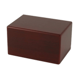
Material and Finish: Why the Same Text Looks Different on Different Urns
Engraving is not “one uniform output.” The material changes the result. A high-polish metal can show crisp engraving but also shows fingerprints and glare. A matte finish can improve readability but may look subtler. Wood engraving can look warm and soft but may have less contrast depending on stain and grain.
If you want a practical reference for how engraving and personalization fit into urn selection, Funeral.com’s article on custom engraved urns emphasizes that engraved names, dates, quotes, and symbols create a lasting tribute and that materials and styles affect the final look: The Significance of Custom Engraved Urns
The key is to match your expectations to the finish. If your goal is maximum legibility, prioritize higher contrast and simpler fonts. If your goal is subtle elegance, you can accept lighter contrast and fewer words.
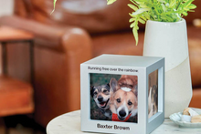
Artwork, Symbols, and Emblems: The Space They Consume
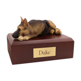
Many families want a small symbol—a dove, heart, cross, military emblem, paw print, or flower—because a symbol can say what words cannot. Funeral.com’s engraving page notes a library of over 120 designs for meaningful artwork and symbols.
Here is the practical consequence: artwork usually consumes space that would otherwise be text space. So the right question is not “Can I add a symbol?” The right question is “If I add a symbol, how many text lines remain, and how does it affect font size?”
The Proof Process: The One Step That Prevents Avoidable Regret
Engraving is not a product you “exchange” easily after it’s been customized. That’s why proofing matters. Before you order, ask whether you will receive a proof or layout preview showing line breaks, font selection, and spacing. Some engraving workflows provide a proof for approval; others do not unless requested or unless the inscription is complex. If a proof is available, treat it as essential.
When you review a proof, read it out loud slowly. Then read it again while looking only at the line breaks. If the line breaks make you stumble, adjust them. Funeral.com’s personalization guidance for pet urns recommends copying and reading your inscription aloud as a way to catch errors and awkward phrasing.
The Questions to Ask Before You Order (In the Exact Language That Gets Answers)
If you want a simple “ask list” that works with almost any provider, these questions are the most efficient:
- What is the maximum number of lines for this specific urn, and does artwork count as a line?
- What is the maximum characters per line, including spaces and punctuation?
- What fonts are available, and which font do you recommend for readability with my text length?
- Will I receive a proof showing line breaks and spacing before engraving begins?
- Where will the engraving be placed, and what is the engravable area size? (Front, back, lid, plate.)
- Is the engraving laser, rotary, or another method, and does that affect contrast on this material?
- What is the turnaround time, and what happens if I need to correct a typo after submission?
If you’re ordering multiple pieces—like one primary urn plus keepsakes for siblings—ask whether the engraving can be matched across items, especially if you’re mixing materials. For sharing pieces, browse keepsake urns. For wearable memorials, browse cremation jewelry. The smaller the surface, the more you should default to short wording and high legibility fonts.
Care Guidance: Keeping Engraving Readable for the Long Term
Once the urn is engraved, caring for it is usually simple, but one mistake is common: abrasive cleaning that dulls contrast or scratches a polished finish. Use a soft cloth. Avoid harsh chemicals. If the urn is metal, avoid aggressive polishing compounds unless the product instructions support them. If it is wood, keep it away from sustained humidity and direct sun. If it is ceramic or glass, prioritize stable placement to avoid impact.
If your urn will be placed in a columbarium niche, remember that readability may depend on lighting and viewing distance. A clean, readable font often matters more than a long inscription. If you’re preparing for niche placement, this guide helps you avoid the most common fit mistakes before you order: Columbarium Niche Fit.
The Bottom Line
Urn engraving looks best when it is planned like a small design: the right number of lines, the right character count per line, line breaks that create calm hierarchy, and a font that stays readable at the size your urn allows. Funeral.com confirms many engravable urns support up to six lines of custom text and offers multiple font styles, which gives families flexibility—but the best results come when you ask the “space and legibility” questions before you fall in love with a long phrase: Personalized Cremation Urn Engraving
If you want wording ideas that are already designed to fit small spaces cleanly, this library is the most practical starting point: Epitaph Examples. Then, once you have your draft wording, treat the questions above as your final “pre-order checklist.” They will save you from the most common engraving regrets.


