
When you are choosing colors on purpose—whether for a room, a design, or a memorial item—you are doing something quietly powerful. You are translating feeling into something other people can see. That is why color choices can feel surprisingly emotional during grief. A “simple” decision like navy or sky blue can suddenly feel like it carries the weight of a whole relationship.
This guide to color symbolism is meant to make those choices feel calmer. We will talk about the meaning of colors in a practical way, with room for the truth that meaning is never one-size-fits-all. We will also connect color to real-life memorial decisions—like choosing cremation urns, pet urns, or cremation jewelry—because for many families today, personalization is not a “detail.” It is the way love becomes visible.
Why Color Meanings Feel Personal (Because They Are)
Color meanings are shaped by three forces that overlap: our bodies, our culture, and our context. Research in color psychology suggests colors can influence attention, emotion, and evaluation, but the effects depend heavily on situation—what researchers sometimes call “color-in-context.” A broad review of research on color and psychological functioning highlights that color can carry meaning and influence affect, cognition, and behavior, while also emphasizing that context and methodology matter for what we can conclude (Elliot (2015) review in Frontiers in Psychology).
Culture matters just as much. A large cross-national study of color–emotion associations across 30 nations found patterns that are partly shared and partly shaped by language and geography (Jonauskaite et al., 2020). In plain terms, some associations show up in many places, but you should never assume a color means the same thing to every person in the room.
And then there is context: the place, the relationship, the tradition, and the moment in life. The same white that feels clean and hopeful in a sunlit living room can feel stark in a hospital corridor. The same red that feels celebratory at a family gathering can feel harsh on an urn displayed in a quiet corner. If you take only one idea from this guide, let it be this: the “right” color is the one that communicates what you mean in the setting you are using it.
Color and Memorial Choices in 2026: Why This Comes Up So Often Now
Color questions come up more often today because more families are making more personalized choices. According to the National Funeral Directors Association, the U.S. cremation rate is projected to be 63.4% in 2025 (with a projected burial rate of 31.6%), reflecting how widely cremation has become the mainstream path for disposition. The Cremation Association of North America reports a U.S. cremation rate of 61.8% in 2024. When cremation is common, families are more frequently deciding what happens next—how to memorialize, where to place remains, how to share them, and how to make the tribute feel like the person (or pet) you love.
That is where color enters the room. Color shows up in printed programs, flowers, candles, photos, clothing, and the actual memorial pieces you keep. It shows up in cremation urns for ashes displayed at home, in small cremation urns meant for sharing, in keepsake urns that sit near a bed or in an office, and in cremation necklaces that become part of everyday life. It also shows up in funeral planning decisions—because when you choose color with intention, it can create coherence, comfort, and a sense of “this feels like them.”
If you are early in the process and want a practical overview of what decisions tend to come first, Funeral.com’s How to Plan a Funeral in 2025 can help you understand the sequence without making it feel like a project plan.
Common Color Symbolism (And How to Use It Without Overthinking)
Below are common associations many people recognize. Treat these as a starting vocabulary, not a rulebook. In a memorial setting, it can be helpful to choose one “anchor” color (what the room is mostly made of), one “support” color (what softens and balances), and one “accent” color (what carries meaning in small moments). That is a simple way to apply color theory basics without turning grief into homework.
Blue: Calm, Trust, Continuity, and Often “Wisdom”
Blue is often chosen because it quiets a space. It tends to read as steady, reflective, and safe—an emotional tone many families want when everything else feels unstable. In memorial contexts, blue can also represent continuity: sky, water, horizon, the sense that love is still present even when the person is not. If you are searching what color represents wisdom, many people point to deeper blues (navy, indigo) as “thoughtful” and “wise,” especially when paired with a simple neutral like white, stone, or warm gray.
Blue is also a practical color for memorial items because it can feel traditional without being heavy. If you are browsing cremation urns, you will notice how often blue appears—sometimes as a calm enamel, sometimes as glass, sometimes as a subtle accent in a pattern. Blue can be a way to add meaning without making the urn feel like décor.
Green: Nature, Renewal, Peace, and “Life Continuing”
Green often reads as grounded and restorative. It can signal renewal and life continuing, which is why it pairs naturally with outdoor memorials, garden ceremonies, and eco-friendly choices. When families are considering scattering or biodegradable options, green can reinforce the idea of returning to nature. If your plans include water burial or other nature-based rituals, green and blue together often feel like a gentle bridge between land and water.
For families thinking about environmentally mindful choices, it can help to start with your plan first and the product second. Funeral.com’s guide to water burial urns explains how different designs float, sink, or dissolve, which is a practical detail that matters more than color once you are on the shoreline.
White: Simplicity, Clarity, Peace, and Sacred Space
White is often chosen for its simplicity. In design, it makes space. In grief, it can feel like permission to breathe. Some families avoid white because it feels too stark; others love it because it feels honest and quiet. White is also a strong choice when you want the focus to be on a photo, an engraved name, or a small symbol rather than on the container itself.
White can be especially comforting for home memorials because it blends into everyday environments. If you are keeping ashes at home, the goal is often to create a space that feels like love, not like a display. Funeral.com’s guide to keeping ashes at home walks through respectful placement and the practical realities of living with an urn day to day.
Black: Formality, Elegance, Protection, and Grief
Black is often associated with mourning in many Western contexts, but it can also read as elegant, protected, and formal. In a memorial setting, black can feel grounding—especially when paired with a warm neutral (cream, wood, brushed metal) so it does not become visually harsh. Black can be a strong choice for families who want the memorial to feel timeless and private rather than decorative.
Purple: Dignity, Depth, Spirituality, and Often “Wisdom”
Purple is one of the most frequently cited answers to what color represents wisdom. It often reads as dignified and contemplative, and it carries a long history of being used for meaning-rich settings (spiritual, ceremonial, or royal). In practical design terms, purple can work beautifully as an accent color—lavender in flowers, a violet ribbon, a deep plum detail in a printed program—because small amounts can carry a lot of symbolism.
If you are intentionally choosing “wisdom” as the message, purple and deep blue together often feel like reflection and depth rather than sadness. That combination can be especially meaningful when the person you are honoring was a teacher, a grandparent, a mentor, or simply someone whose steady guidance shaped the family.
Red: Love, Intensity, Vitality, and Sometimes “Too Loud”
Red is complicated in grief because it is powerful. In some cultures it is deeply auspicious; in other contexts it can read as warning or intensity. Research on color-in-context frequently uses red as an example of how meaning changes by setting, and the broader literature emphasizes that color effects depend on context and interpretation (Elliot (2015) review). In memorial design, red often works best as a controlled accent: a single rose, a small heart motif, a subtle gemstone color in jewelry—enough to communicate love without overwhelming the room.
How to Choose a Memorial Color Palette That Feels Like Them
If you are designing a service, choosing an urn, or selecting a keepsake, the question is not “What does this color mean in general?” The better question is “What does this color mean to us?” A few grounding checks can help you choose with intention without spiraling.
- Start with what they actually wore, decorated with, or loved: favorite sweater color, a sports team, a garden, a painting, a specific shade that shows up in family photos.
- Decide what emotional tone you want the room to hold: calm, warm, bright, formal, earthy, or quietly sacred.
- Choose one anchor neutral (white, cream, charcoal, wood tones) so the meaningful color does not have to do all the work alone.
- Use the meaningful color as a thread: a ribbon, a program accent, a flower, a photo mat, a small candle—repeated lightly so it feels coherent rather than loud.
This approach works for home memorials too. If you are building a shelf or small table, color can help the space feel intentional: a framed photo, a candle, a small vase, and the urn or keepsake. You are not “decorating” a person’s remains; you are creating a place where love can land.
How Color Connects to Urns, Keepsakes, and Jewelry Choices
Color becomes most meaningful when it is tied to the way you plan to memorialize. Many families choose a primary urn for the household and then smaller pieces for sharing. That is where the categories matter: cremation urns for ashes for the main tribute, small cremation urns for portions, and keepsake urns when you want a tiny vessel that feels personal and close.
If you want guidance on choosing an urn based on plan, size, and material—not just style—Funeral.com’s How to Choose the Best Cremation Urn is designed to steady that decision. It can also be helpful to start with the bigger question of what to do with ashes, because the answer determines the right vessel. Funeral.com’s guide What to Do With Cremation Ashes walks through options in a way that helps families make a plan that can evolve over time.
Color is also a practical tool in jewelry. With cremation jewelry, you may be choosing between stainless steel, sterling silver, gold-tone finishes, enamel accents, or symbolic shapes. Sometimes the “color” is the metal itself. Sometimes it is a small inlay or a gemstone tone that carries meaning quietly. If you are considering cremation necklaces specifically, Funeral.com’s cremation jewelry guide can help you think through everyday wear, filling, and care—practical details that matter when a piece is meant to last.
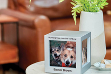
Color Symbolism for Pet Memorials (Because Pet Grief Is Real Grief)
Pet loss is often the grief people feel in their daily routines: the empty spot on the couch, the silence at the door, the missing sound of tags. Color can be especially comforting in pet memorials because it can reflect the pet’s personality—playful, gentle, brave, stubborn, sweet. Some families choose the color of the pet’s collar. Others choose a color that represents the feeling the pet brought into the home.
If you are choosing pet urns, it helps to decide whether you want a single full-size tribute, a sharing plan, or something more sculptural. Funeral.com’s pet urns for ashes collection includes a wide range of options, while pet figurine cremation urns can be especially meaningful when you want a piece that visually captures your companion’s presence. If your family wants multiple small tributes, pet cremation urns keepsake options make it possible to share a portion respectfully.
For families who want a step-by-step guide through size, style, and personalization, Funeral.com’s pet urns for ashes guide can make the decision feel less overwhelming—especially if you are choosing while still raw with grief.
Color and Ceremony Choices: Home, Service, Scattering, and Water
Once you know your broader plan, color becomes easier. If your plan is a home memorial first and a ceremony later, you may choose a neutral urn now and save the symbolic color for the gathering—flowers, printed materials, photo boards, or a memory table. If your plan is scattering, you may choose a vessel designed for the moment rather than for display, and then choose a keepsake or jewelry piece for long-term comfort.
If your plan includes water burial, color can be part of the symbolism: blues and greens for water and continuity, whites for peace, a single accent color that represents the person. The key is that the practical rules matter too. Funeral.com’s water burial and burial-at-sea guide explains what “three nautical miles” means in real planning terms, and it references the U.S. EPA framework families typically need to understand for ocean ceremonies. When you are ready to choose a vessel designed for that moment, the companion guide on biodegradable ocean and water burial urns can help you select based on how the urn behaves in wind and water, not just how it looks.
Cost Reality: Choosing Meaning Without Financial Shock
Color choices are not separate from budget choices. Families often want something beautiful and personal, and they also need the numbers to make sense. According to the National Funeral Directors Association, the national median cost in 2023 was $8,300 for a funeral with viewing and burial and $6,280 for a funeral with viewing and cremation. If you are trying to understand how much does cremation cost in your area, those medians can provide context, but your local quotes will vary based on provider model and what is included.
If you want a plain-English walkthrough of direct cremation, common fees, and what to compare, Funeral.com’s how much does cremation cost guide is designed to make the numbers feel less intimidating. And if you are planning ahead, Funeral.com’s funeral planning and cremation preplanning guide connects the paperwork to the real-life choices families often make later: urns, keepsakes, jewelry, and what happens with ashes over time.
A Gentle Bottom Line: Color Is a Language, Not a Test
If you are choosing colors right now, you are probably doing it in the middle of something hard. Give yourself permission to keep it simple. You do not have to “get it perfect” for the choice to be meaningful. Color is a language, and like any language, what matters most is clarity and sincerity.
Choose the colors that tell the truth about who they were, what they brought into the room, and what you want to carry forward. And if your plan changes—as grief shifts, as family needs evolve, as time passes—that is not a mistake. That is love adapting to a new shape.


