

The Meaning of Blue in Memorial Design
Hey there, welcome back to the funeral.com podcast! Today, we’re diving into something that’s surprisingly universal—but often overlooked—the emotional power of color in memorial design. Let’s talk about why your choice of blue isn’t just aesthetic, but deeply personal.
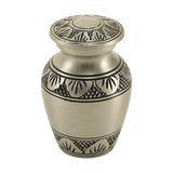
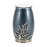
So here’s the thing: colors hold meaning, right? Blue, for example, is often associated with calm, trust, and reliability. But it’s not just about slapping a 'trustworthy' label onto it—blue can be steadying, like the calm of lake water or the early morning sky. It’s why families often gravitate toward it in memorial spaces.
I remember a story about a woman who chose a navy urn because it reminded her of her husband’s favorite jacket—the one he wore on every anniversary. Imagine that! The color wasn’t just a choice; it was a connection, a piece of their shared life brought into the present.
But here’s the counterpoint: blue can also feel distant if overused or paired poorly. If everything in a memorial space is stark and glossy blue, it can feel cold—almost clinical. That’s not what you want when creating a space for remembrance.
So, moving forward, think about how color can be layered to tell a story. Add warmth—natural wood, soft lighting, maybe even a textured fabric nearby. These small choices can make blue feel human and comforting, not detached. Let’s keep exploring this idea in the next segment!
Cremation Trends and Practical Design Decisions
Alright, let’s shift gears a bit and talk about cremation trends and how they tie into practical design choices. Did you know the U.S. cremation rate is expected to hit 63.4% by 2025? That’s huge! Families are increasingly making these decisions, and design plays a big role in the experience.
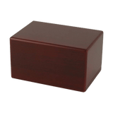
Picture this: a family sitting down with a catalog of urns, overwhelmed by choices. It’s not just about picking a container—it’s about deciding where the ashes will live, how they’ll be shared, and what feels 'right' emotionally. The design of that urn matters more than you’d think.
One family I heard about chose a scattering urn because their plan was to release ashes into the ocean—a place their loved one adored. But they didn’t just stop there; they added small keepsake urns for family members who wanted something tangible to hold onto. It turned into a beautiful blend of practicality and sentiment.
Now, not everyone feels at ease with these decisions. Some people struggle with the idea of permanence—'Will this urn feel like a home for years?' Others worry about emotional overload. That’s where thoughtful design comes in, easing the friction of choice.
Looking ahead, the rise in cremation is shaping how families approach memorials. It’s not just about the container anymore—it’s about creating an environment that feels sustainable, adaptable, and deeply personal. Let’s explore how this ties into pet memorials next!
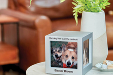
Pet Memorials: Designing for Intimacy and Routine
Okay, so let’s talk about something close to my heart: pet memorials. Losing a pet is different—it’s intimate, it’s tied to daily routines, and it’s deeply personal. How do you design a memorial for that kind of grief?
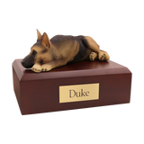
For many families, the goal isn’t a grand display; it’s closeness without overwhelm. A small urn on a shelf, a figurine urn shaped like the pet—it’s about creating a gentle reminder that blends into daily life. Blue can play a quiet role here, offering calm and steadiness.
I remember hearing about a family who chose a figurine urn for their German shepherd. Every day, they’d walk past it on the mantel, and it felt like their companion was still there in spirit. That’s the power of thoughtful design—it helps grief feel survivable.
Now, here’s the flip side: not everyone wants a visible reminder. Some prefer cremation jewelry—a pendant or bracelet they can carry privately. It’s portable, intimate, and doesn’t demand constant attention.
As we move forward, ask yourself this: what would make your memorial space feel safe on a hard day? Whether it’s a figurine, a keepsake urn, or even a discreet piece of jewelry, the design should reflect your emotional needs—not someone else’s idea of 'perfect.'
The Ethics of Design in Grief and Marketing
Alright, let’s wrap this up with a big-picture reflection: the ethics of design in grief and marketing. Why does blue dominate these spaces? Is it just a branding trick, or is there something deeper going on? Let’s break it down.
Research shows that blue is associated with trust and calm—qualities people look for in healthcare, finance, and yes, end-of-life planning. But here’s the key: it works best when it’s used to support, not manipulate. Honest design builds trust, and trust builds comfort.
I once saw a funeral website that used red accents everywhere—urgent buttons, flashy banners. Honestly, it felt overwhelming, like the site was shouting at me. Compare that to a calm blue layout with straightforward language—it felt like a safe place to explore options without pressure.
But here’s the challenge: blue can’t do the heavy lifting alone. It needs warmth, transparency, and human-centered design to truly resonate. It’s about creating spaces—digital or physical—that feel steady and supportive, especially in moments of grief.
As you navigate memorial choices—urns, jewelry, or even website designs—ask yourself this: does it feel usable? Does it feel honest? In the end, comfort isn’t just a nice-to-have—it’s what helps people keep going. Alright, that’s all for this episode! Thanks for listening, and we’ll catch you next time.


