


Symbolism of Peaceful Colors
Hey everyone, welcome back to the show. Today, we’re diving into something quietly powerful—the role of color in grief and remembrance. It’s fascinating how colors don’t just decorate a space; they can actually shape how we feel in it. Picture walking into a room filled with soft blues and greens—it’s soothing, right? Now contrast that with fiery reds. Big emotional shift, huh?
Let me share a quick story. My friend, Sarah, was planning a memorial for her dad and decided on a nature-inspired palette: sage green, warm cream, and light wood tones. It wasn’t just a design choice; it was her way of creating a peaceful space where everyone could breathe—literally and emotionally. People left saying, 'It felt like him.' That’s the magic of thoughtful color.
But, of course, there’s a counterpoint: color is deeply subjective. For example, white is often associated with peace for many, but in some cultures, it’s the color of mourning. So while you might think cream or ivory will universally calm a space, it might evoke something entirely different depending on who’s there. This makes it crucial to consider traditions and personal resonance.
Looking forward, I think we’re seeing more people approach memorial design with an eye for emotional intentionality. It’s less about grand gestures and more about creating spaces that feel safe, comforting, and true to the person being remembered. So, as we explore this topic, think about the colors that make your shoulders drop and your breath slow. That’s usually your peace palette.
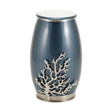
Blue: The Universal Symbol of Calm and Trust
Alright, let’s talk about the color blue—probably the most recognized 'peace color' globally. When you think of blue, you might picture the sky, the ocean, or even the United Nations emblem. Fun fact: the UN chose its iconic 'UN blue' to symbolize diplomacy and global harmony, as a counterpoint to war-like reds. Pretty intentional, huh?
Here’s an example from my own life. When my grandmother passed, we created a small remembrance corner in the living room, anchored by a dusty blue vase with fresh flowers. That simple touch made the space feel tranquil without being heavy. It wasn’t just about aesthetics; it was about grounding the grief in something steady.
Still, blue isn’t a slam dunk for everyone. Bright, saturated blues can feel cold or clinical instead of calming. And overly dark blues might tip into sadness rather than serenity. It’s all about the tone—muted teals, slate blues, and soft navies often evoke a gentler vibe that feels more universally soothing.
Moving forward, blue’s versatility makes it perfect for memorials that integrate into everyday life. Think subtle blue accents in keepsakes, urns, or even home décor. It’s about creating spaces that can quietly hold both memory and peace, without demanding attention. If you’re wondering what shade of blue resonates most with you, think: sky at dusk or water on a calm day.
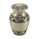
White: Simplicity and Space in Moments of Reflection
Let’s shift gears to white—a color that often represents simplicity, truce, and breathing room. White is like a blank slate, a visual way of saying, 'Let’s pause here.' It’s why we associate white flags with peace and why white works so well in memorials—it doesn’t compete with the moment. It creates space for it.
Here’s a story from a listener. Maria shared how she chose ivory and oatmeal tones for her brother’s celebration of life. She added texture with linen tablecloths and unglazed ceramic vases. The result? A space that felt human, warm, and inviting—not sterile like a hospital room. Everyone commented on how the atmosphere felt comforting.
But here’s the challenge: white isn’t always 'neutral.' In some cultures, it’s tied directly to mourning, and it can feel stark or even empty if overused. That’s why it’s so important to soften white with warm undertones—think cream, matte finishes, or pairing it with greenery to add a touch of life.
Looking ahead, white remains a flexible choice in memorial design. It pairs beautifully with nearly any accent color, making it a strong base for keepsakes, urns, or even jewelry. But the key? Balance. Let white create space without erasing the warmth of the person you’re remembering.
How Green Represents Renewal and Everyday Peace
Finally, let’s talk about green—the color of renewal, nature, and quiet continuity. Green isn’t just about peace; it’s about the kind of peace you feel outdoors, breathing deeply, surrounded by life. And let’s not forget the olive branch—a timeless symbol of reconciliation and goodwill.
A friend of mine, James, lost his childhood dog recently. For the memorial, he chose a palette of eucalyptus green and soft beige. He even placed a small ivy plant next to the urn on his bookshelf. He told me it wasn’t just about honoring his pet—it was about keeping a piece of the outdoors they loved to explore together.
That said, green isn’t for everyone. In some contexts, it might feel too casual or earthy when people are looking for something more formal. And too much green can overwhelm a space, turning 'peaceful' into 'busy.' The trick is using it as an accent—plants, ribbons, or even subtle touches on keepsakes.
Looking ahead, I see green becoming a bigger part of memorials, especially for families who value sustainability or nature-inspired themes. Whether it’s live plants, biodegradable urns, or simply echoing outdoor spaces, green invites us to hold grief gently, with room for hope and growth.
Thanks for listening to the Funeral.com podcast. For trusted resources, memorial products, and planning support, visit Funeral.com. Follow us for more expert insights and meaningful conversations about honoring life.


