





Blue Symbolism in Grief & Memorial Planning
Hey there, welcome to the funeral.com podcast! Today, we’re diving into something that you might not think about often but is all around us—color. Specifically, the color blue. It’s a hue that’s everywhere, from the sky to the ocean and even in our emotions.
Let’s start with a fact: Did you know that blue is one of the most universally loved colors? Studies show that it’s associated with calmness, trust, and dependability. That’s why you see it in bank logos, police uniforms, and even hospital scrubs.
Now, here’s a little story for you. I remember being at a friend’s surprise party, and everything was decked out in vibrant blue—balloons, tablecloths, even the cake icing. It was all meant to be cheerful, but my friend actually got teary-eyed. Turns out, blue reminded her of her late grandmother, who used to wear a light blue scarf every Sunday. Isn’t it fascinating how a color can carry so much meaning?
But let’s not forget the flip side. Blue can also symbolize sadness—think of the phrase 'feeling blue.' Ever wonder why? It’s because blue is associated with depth and introspection. It can be a quiet, reflective space for our emotions, but also a heavy one.
Looking ahead, I think we’ll see more people using blue intentionally—not just in design, but in how they create spaces for reflection. Imagine a room painted in soft blue tones, designed to be a sanctuary for relaxation or even remembrance. It’s a color that helps us slow down, and honestly, who doesn’t need more of that?
Blue in Mourning: A Color That Holds Duality
Alright, let’s shift gears a bit to a more tender topic—how blue shows up in moments of grief and remembrance. It’s one of those colors that can do two things at once: it can soothe, but it can also be honest about sorrow.
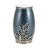
Here’s something to think about: blue is often used in sympathy flowers and even in memorial keepsakes like cremation urns or necklaces. Why? Because it carries a sense of steadiness. It’s like a quiet nod that says, 'I’m here, I’ll hold this space for you.'
I once attended a memorial service where the family had chosen navy blue as the primary color. The programs, the ribbons, even the floral arrangements had this deep, dignified blue. It struck me as both formal and deeply personal, almost like the color itself was wrapping everyone in a sense of calm.
But here’s a counterpoint: not everyone finds blue comforting. For some, it might feel too cold or even evoke a sense of melancholy they’re not ready to sit with. This is why choices around color in grief are so personal—there’s no one-size-fits-all.
As we move forward, I think we’ll see more people blending tradition with personal flair in memorials. Blue might be paired with warm tones like cream or gold to strike a balance. It’s about creating a space that feels right for everyone, but especially for the ones who are grieving the most.
The Psychology of Blue: Why It Calms Us
So let’s talk about the psychology behind blue. Why does it feel so calming to most of us? Well, scientists say it’s because we’re wired to associate blue with the sky and the ocean—two things that are constant and vast, giving us a sense of stability.
Imagine walking into a room with walls painted a soft sky blue. Your shoulders might drop, your breathing might slow, and you just feel… better. That’s not a coincidence. It’s the color’s way of communicating tranquility.
Here’s a fun anecdote: A friend of mine once painted her kitchen walls cobalt blue because she thought it was an energizing color. But after a week, she said, 'I feel like I’m living in a swimming pool!' So, yeah, context matters. Blue can be calm in one setting but overwhelming in another.
Some people argue that blue is overused in design. You see it in branding, healthcare, tech—almost everywhere. Is it really calming, or have we just been conditioned to think so? It’s a fair question.
Looking ahead, I think we’ll see more nuanced uses of blue, especially in emotional spaces. Designers are getting smarter about how to pair blue with other tones, like warm grays or soft greens, to enhance its calming effects without making spaces feel too cold or sterile.
Blue as a Personal and Cultural Symbol
Let’s wrap up with a broader look at blue as a cultural and personal symbol. Across the world, this color means so many different things. In some cultures, blue represents peace and spirituality. In others, it’s linked to authority or even mourning.
Here’s an interesting fact: In ancient Egypt, blue was associated with the sky and the heavens, so it symbolized divinity and protection. Fast forward to today, and blue is still a go-to for creating a sense of safety and trust—think of all those blue logos we see in corporate branding.
A friend of mine told me about her mom’s memorial service. Her mom loved the ocean, so they incorporated ocean blues into everything—table runners, a slideshow background, even the urn they chose. For them, blue wasn’t just calming; it was her essence.
But here’s the thing: not everyone interprets blue the same way. For some, it might feel too somber or even out of place in certain cultural contexts. That’s why it’s so important to think about the individual and the community you’re honoring.
In the end, blue is a color that helps us remember. It doesn’t shout; it whispers. It doesn’t demand attention; it invites reflection. Whether you’re planning a memorial or just thinking about how to use color in your life, let blue teach you how to be both calm and deep.
We appreciate you listening to the Funeral.com Podcast. If today’s episode inspires you to celebrate or remember someone special, explore our selection of urns, keepsakes, and memorial services at Funeral.com. Stay connected with us on Facebook and Instagram for more support and stories.


